

Product Design
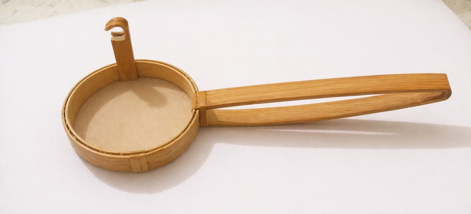
Bamboo Muslin Strainer
Sustainable, detachable kitchen strainer — bamboo & muslin, fully biodegradable.
Designing with purpose. Thinking with empathy.
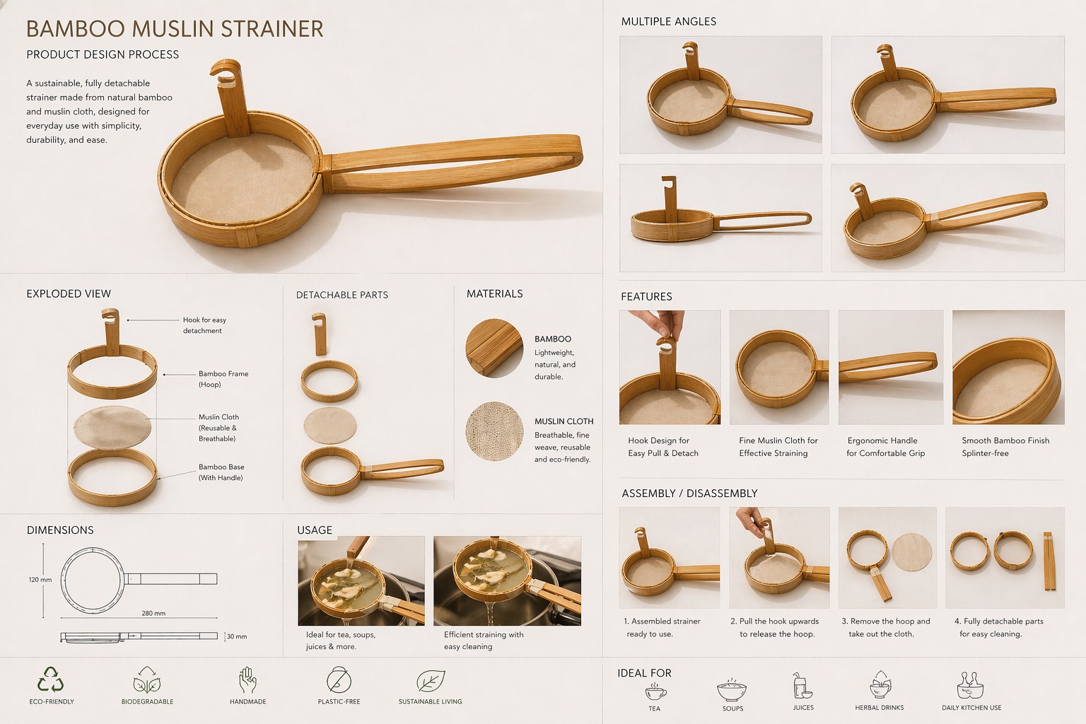
A fully detachable, eco-friendly kitchen strainer made from natural bamboo and muslin cloth. A functional, minimal, and sustainable alternative to conventional plastic or metal strainers.
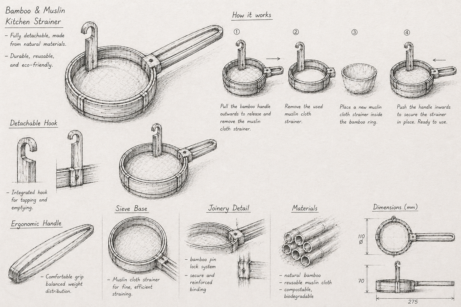
Single upward pull removes muslin cloth — no complex disassembly.
Ergonomic grip using layered bamboo strips, finished without external bindings.
Bamboo + muslin cloth — 100% biodegradable and sustainable.
Any component can be replaced independently, extending product life.
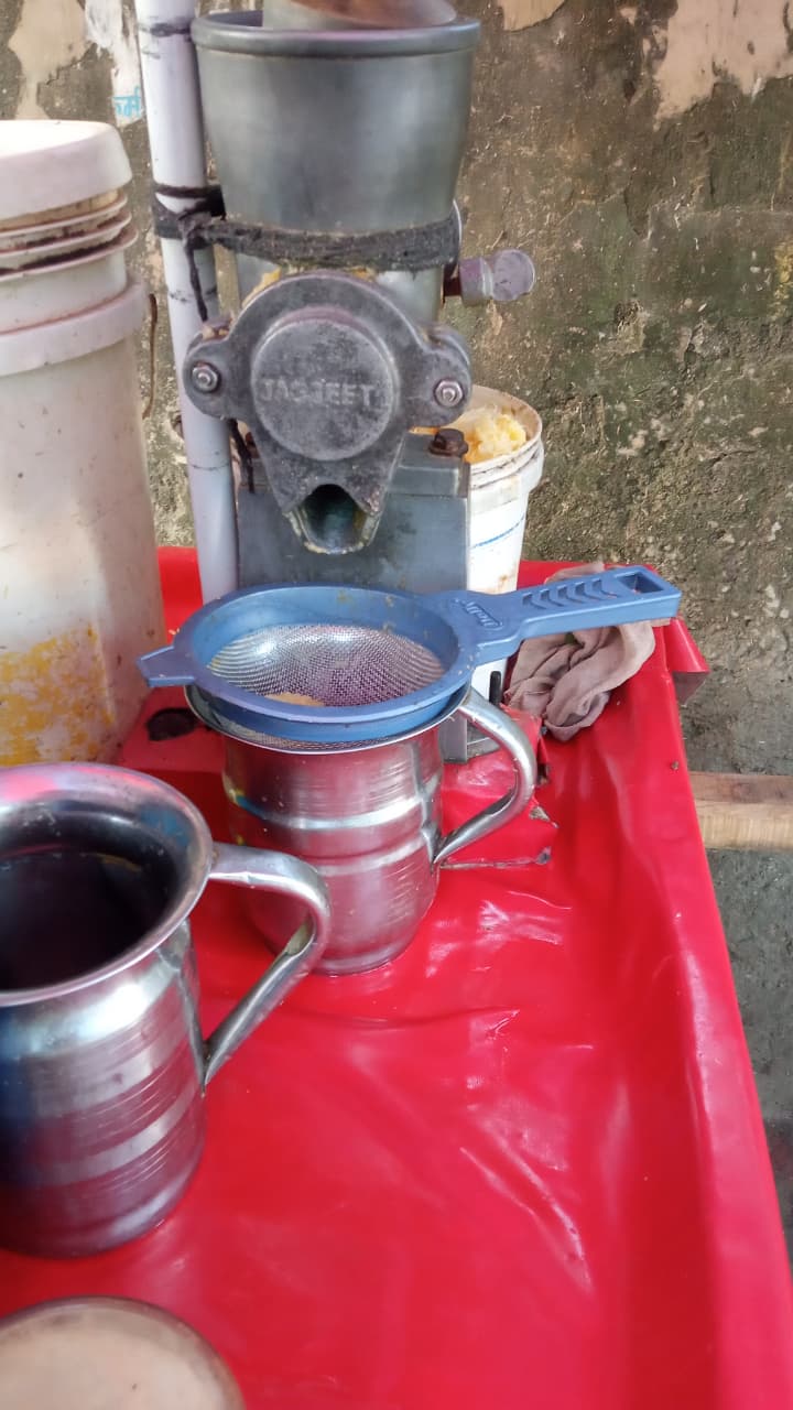
Field observation across tea stalls, juice shops, and household kitchens revealed four recurring pain points with conventional metal strainers — each directly addressed by the Bamboo Muslin Strainer.
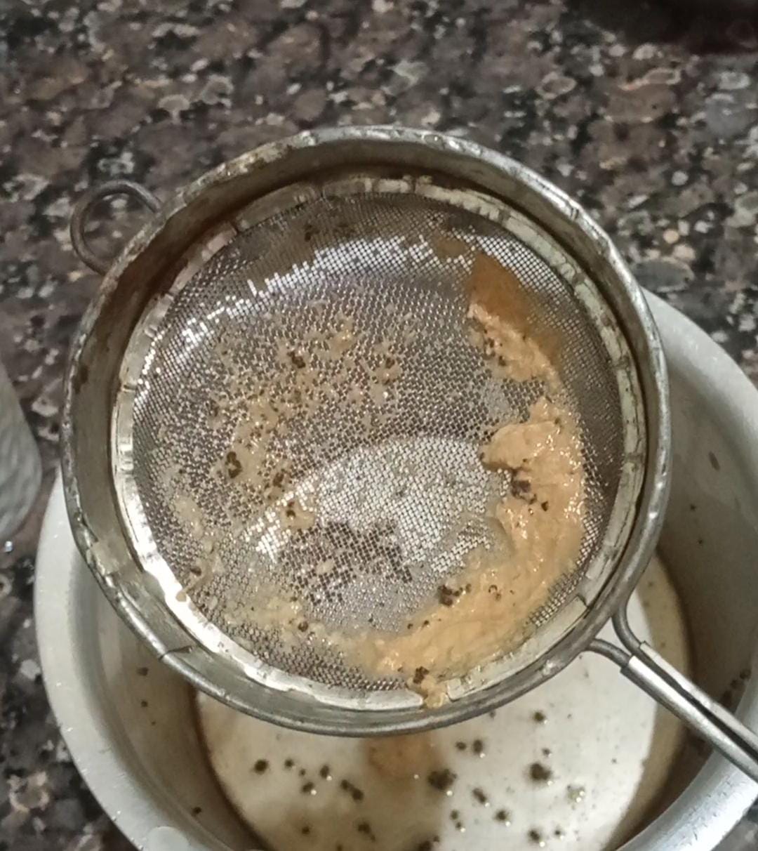
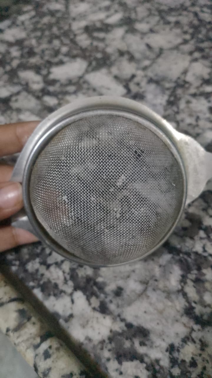
Fine mesh holes trap residue — tea leaves and pulp build up over time, blocking flow and requiring constant scrubbing.
A single hole in the metal mesh means discarding the entire strainer — wasteful and costly.
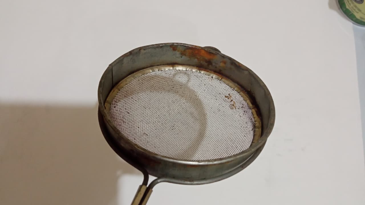
Metal strainers corrode with repeated water exposure — rust contaminates beverages and poses health risks.
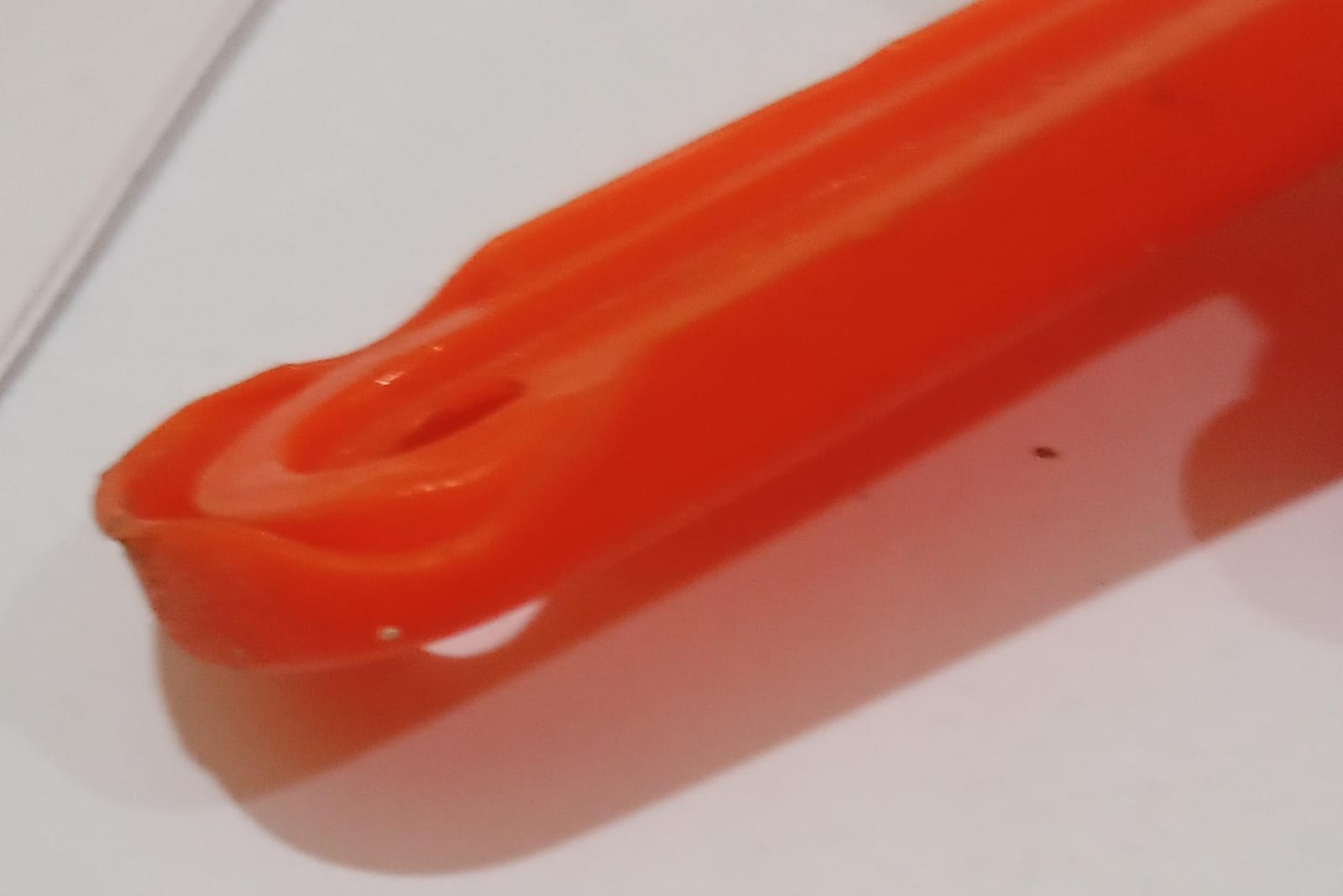
Plastic strainers warp and melt when used with boiling liquids — releasing microplastics and toxic compounds.
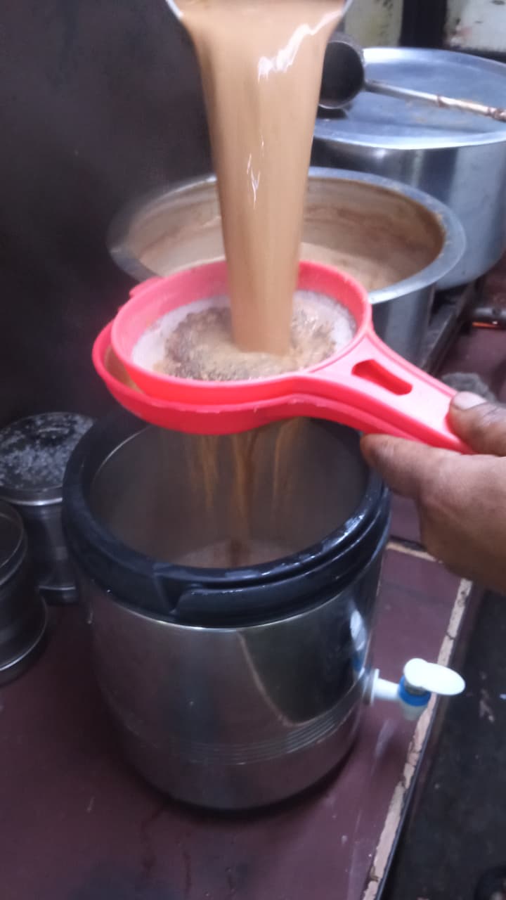 Tea stall observation
 Juice shop observation
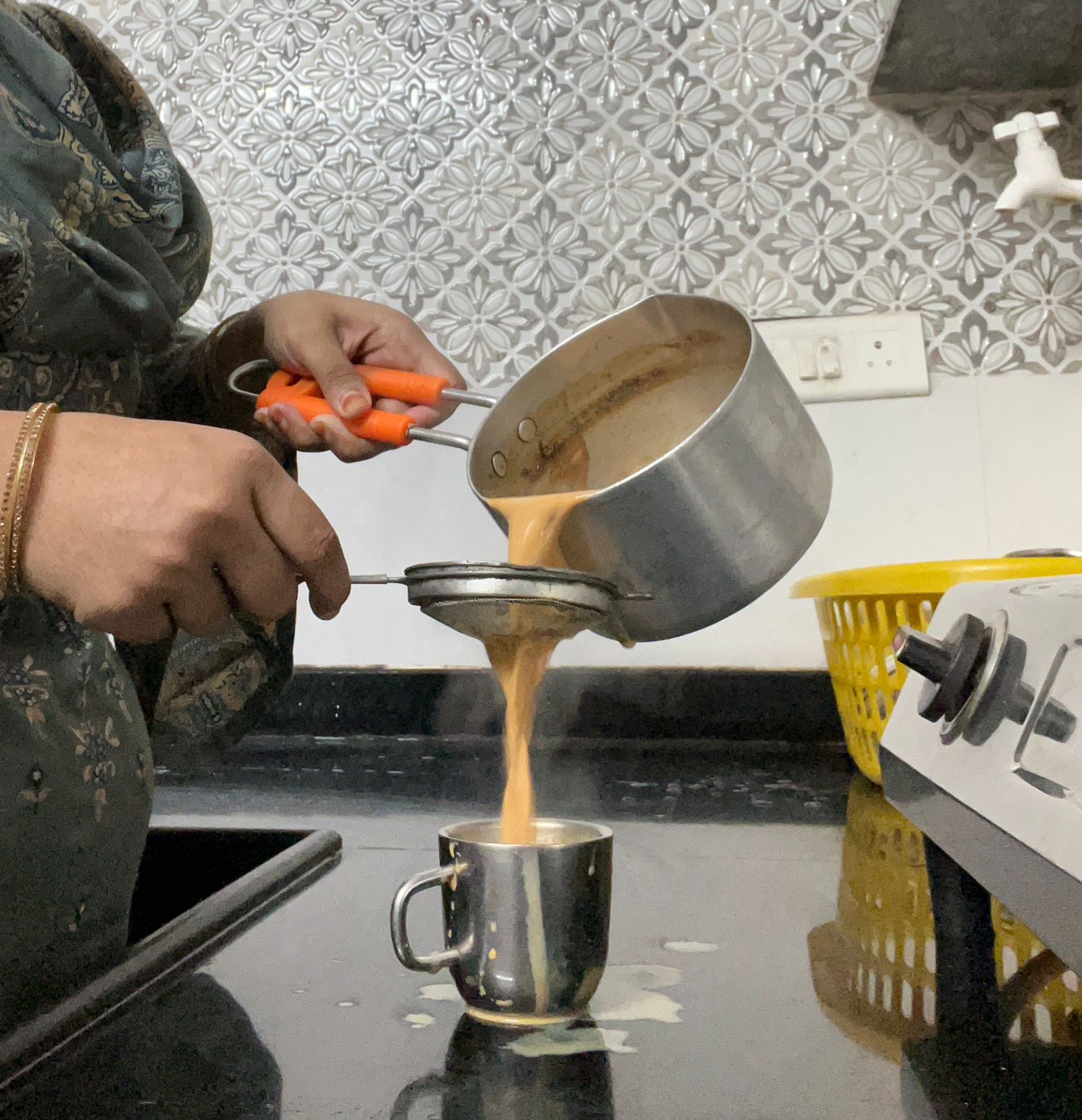 Spilling & overflow
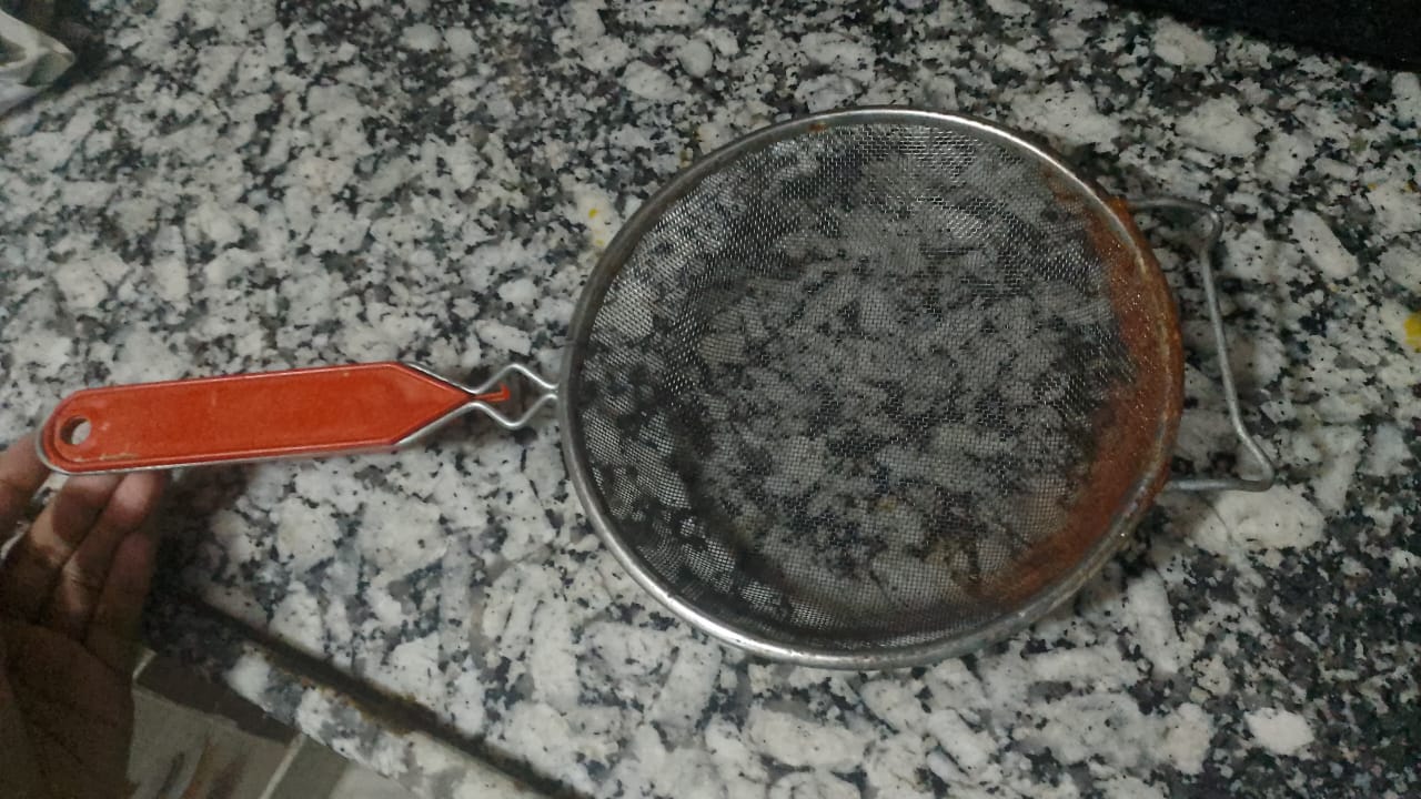 Heavy-use rusting
Ideation pencil sketches — early concept exploration
Rough pencil sketches exploring form, proportions, and the detachable hoop mechanism. Multiple handle configurations and hoop sizes were evaluated.
Explored from multiple angles to validate proportions, joint quality, and ergonomics. Confirms seamless bamboo hoop and muslin cloth integration.
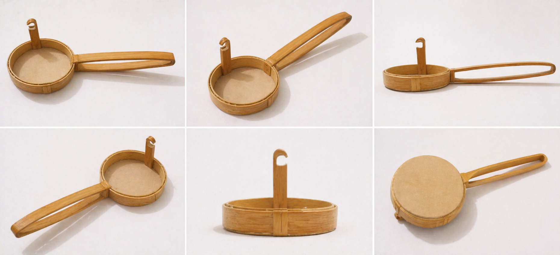
Multiple views & angles
Ideation, iteration, and refinement stages
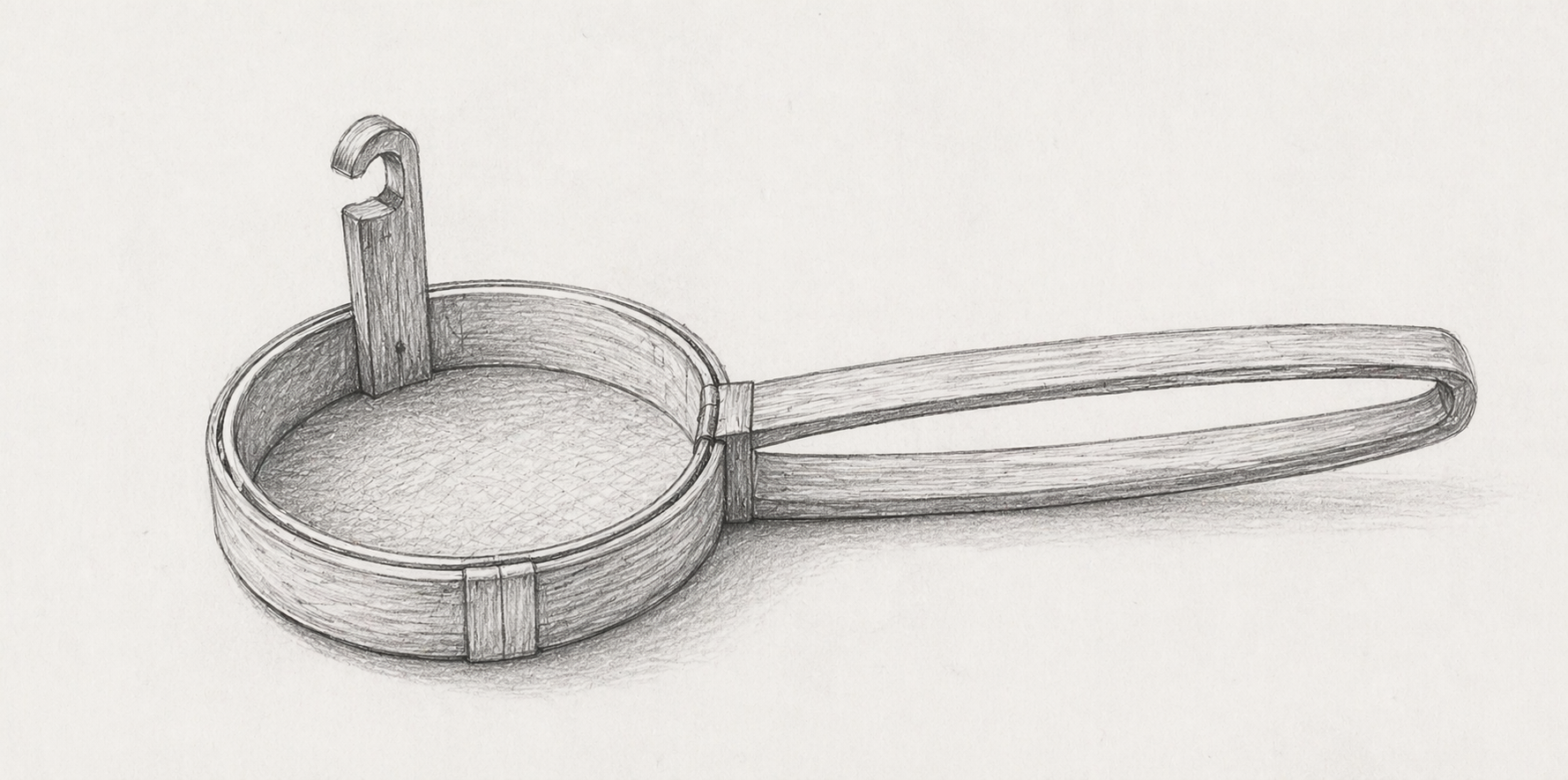
Final pencil sketch — resolved design before build
All proportions, joint positions, and the detachable hook mechanism are precisely defined. Served as the direct blueprint for bamboo construction.
A practical solution for everyday kitchen use — straining tea, juices, and soups. Proof that sustainable design doesn't compromise on function or aesthetics.
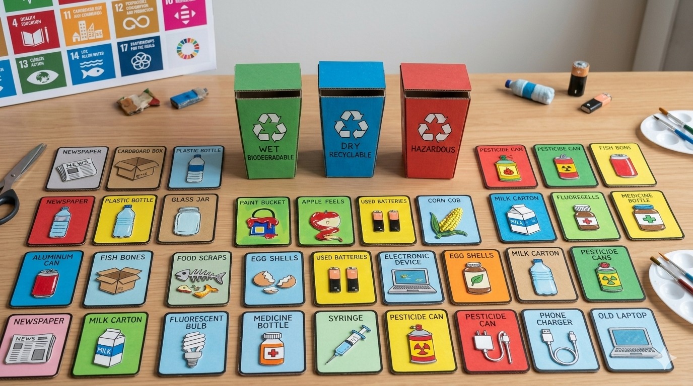
An interactive educational game bridging the gap between waste awareness and actual segregation habits. Transforms a complex environmental task into a fast-paced, sensory-based competition.
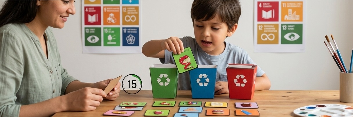
India generates 62 million tonnes of waste annually, yet only 30% is sorted. People understand recycling but find specific categories — Wet, Dry, Hazardous — confusing in practice.
30 handcrafted cards with textured elements to enhance cognitive association through touch.
Competitive two-player format that turns mindful disposal into a reflex.
India's standardized code — Green (Biodegradable), Blue (Non-Bio), Red (Hazardous).
Made from recyclable cardboard. Easily recreated for schools and community centers.
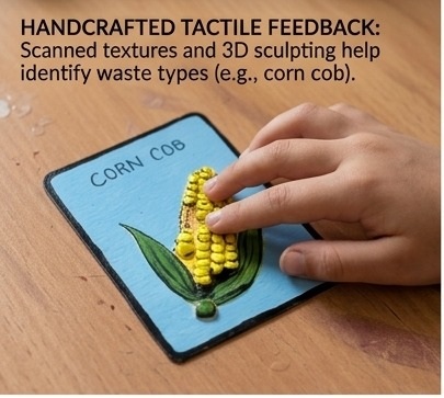
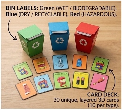
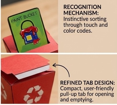
Each card features a waste item with tactile texture cues. Players race to sort the card into the correct bin category.
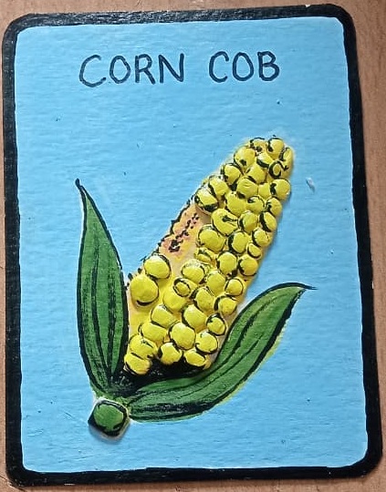 Corn Cob
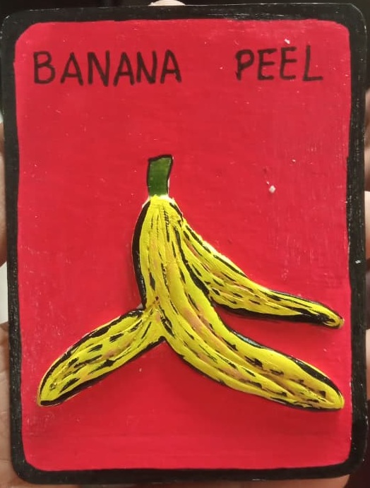 Banana Peel
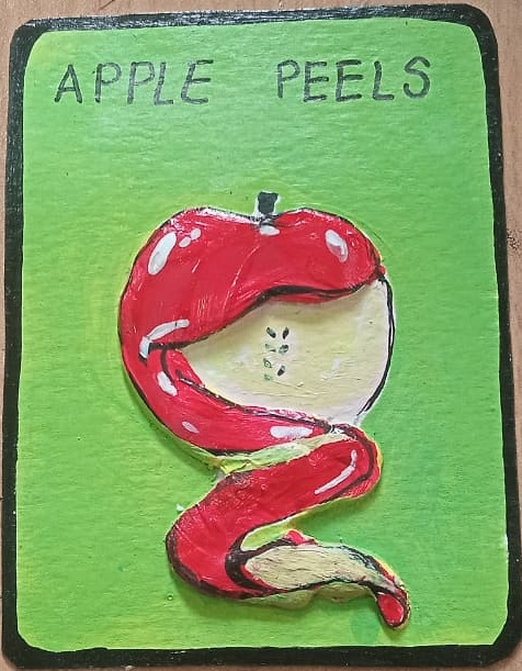 Apple Peels
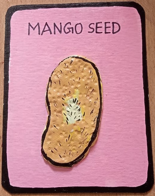 Mango Seed
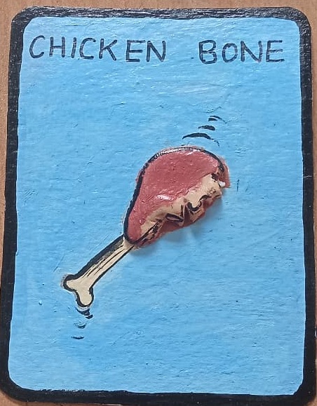 Chicken Bone
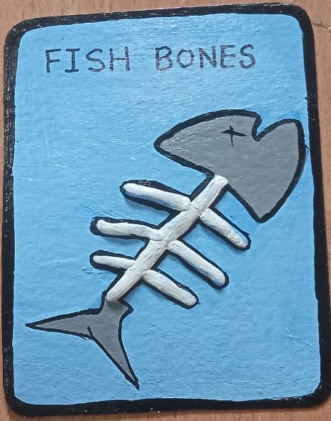 Fish Bones
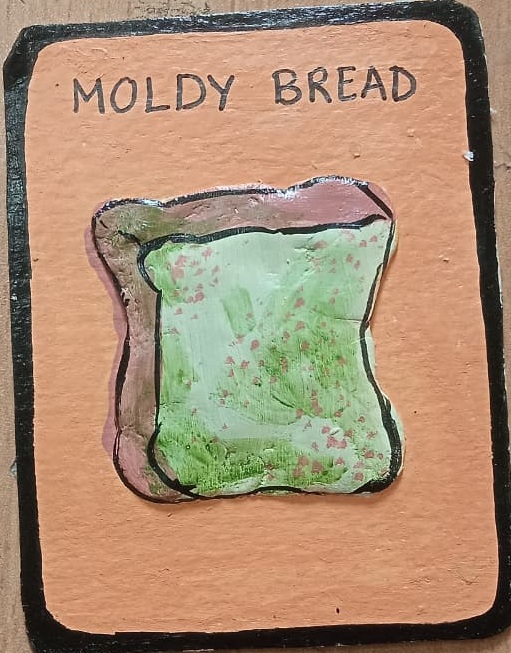 Moldy Bread
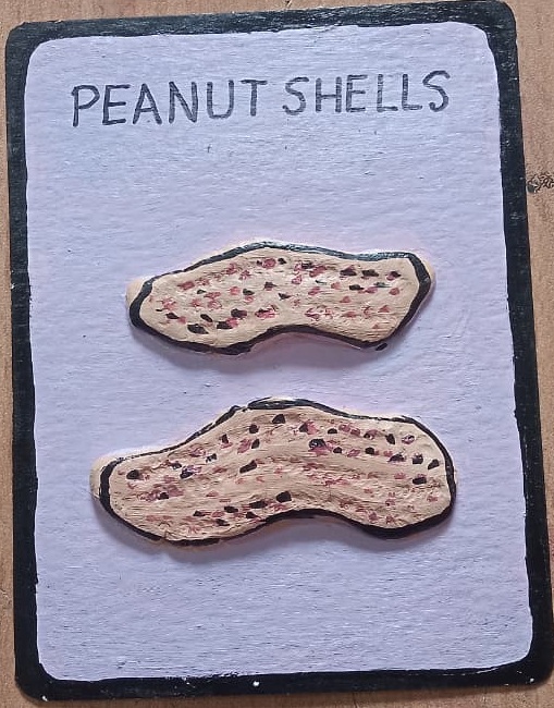 Peanut Shell
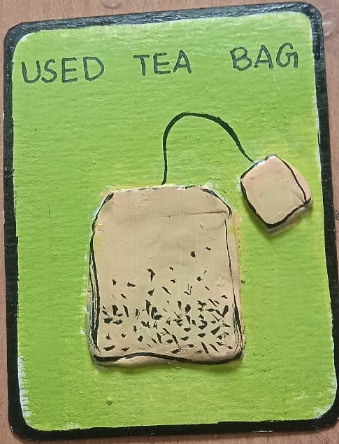 Used Tea Bag
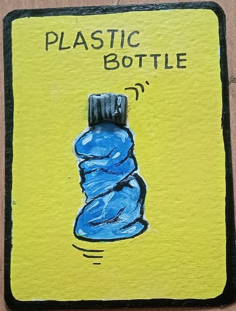 Plastic Bottle
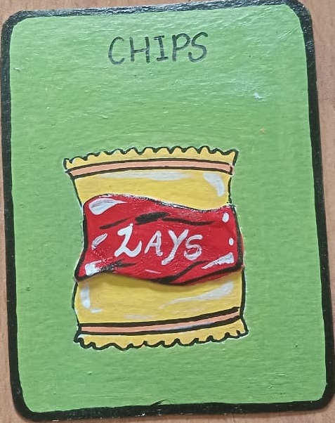 Chips Pack
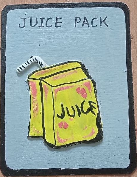 Juice Box
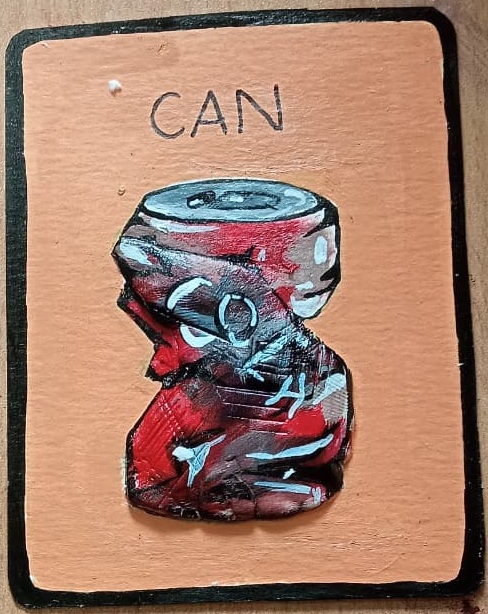 Metal Can
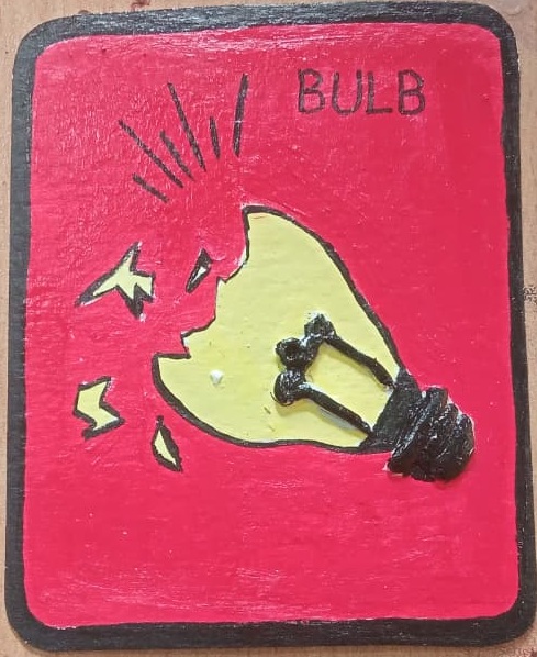 Light Bulb
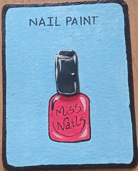 Nail Paint
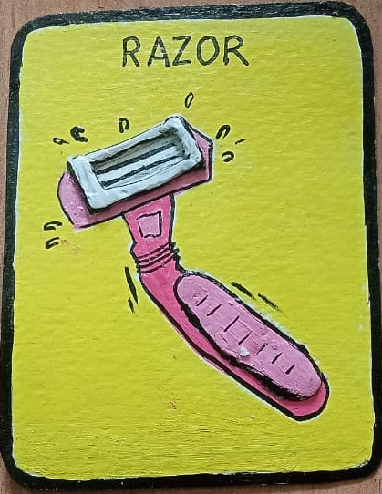 Razor
Razor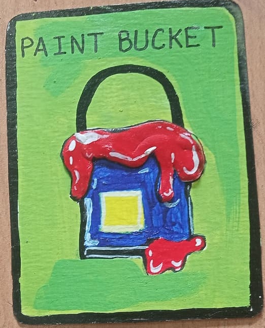 Paint Bucket
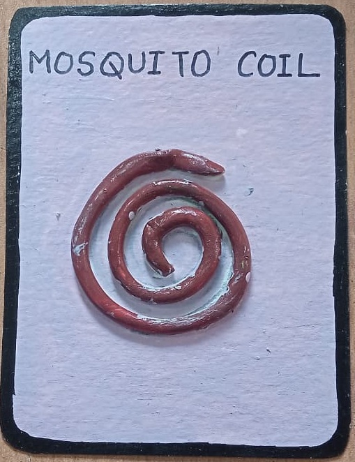 Mosquito Coil
Environmental literacy through play-based learning.
Responsible consumption through community play.
Reducing landfill emissions via source-segregation habits.
Sustainable behavior change doesn't require expensive technology — it needs smart, empathetic design. A simple card game can shift how entire communities think about waste.
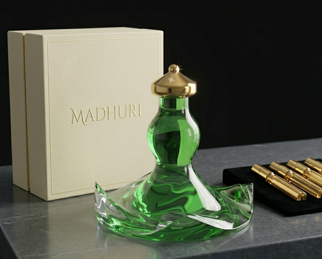
This project translates the identity of Madhuri Dixit into a perfume bottle design inspired by her grace and timeless elegance. The form draws from her iconic green look in Devdas, using fluid curves and soft detailing to reflect movement, femininity, and poise.
Visual research explored Madhuri Dixit's iconic aesthetic — her dance postures, costume palette, jewellery, and the cinematic world of Devdas — to ground every design decision in cultural resonance.

Mood board — visual identity, colour palette, movement references
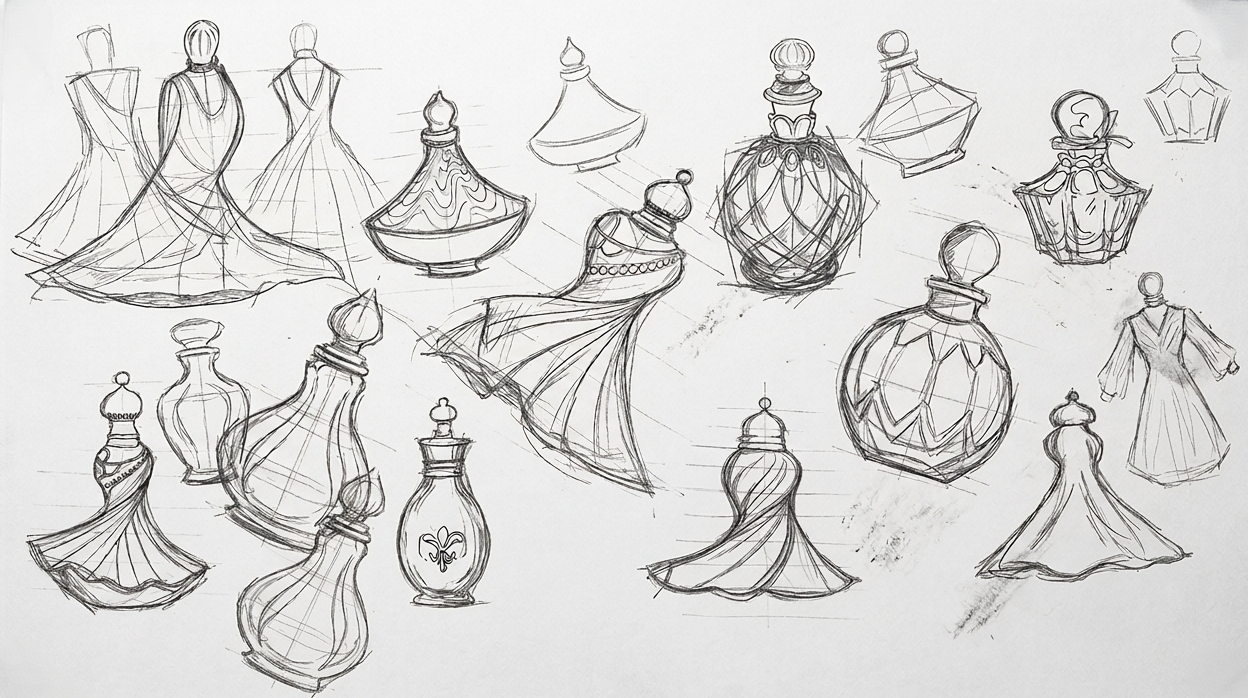
Early concept sketches — initial form exploration
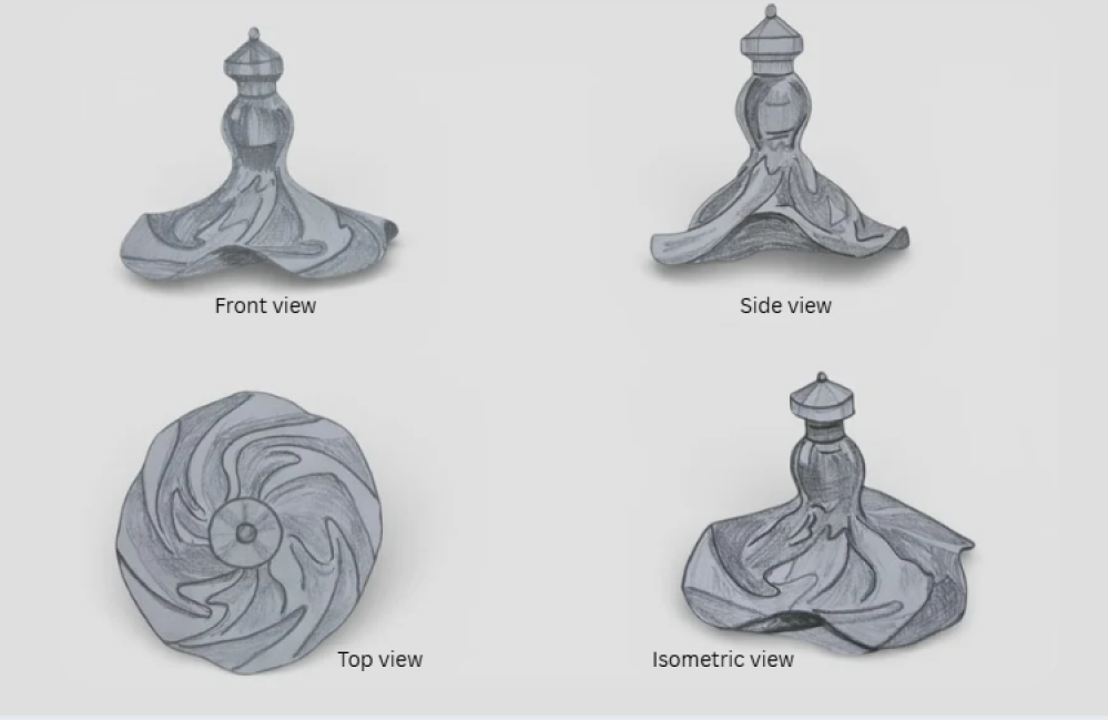
Final ideation sketch — resolved silhouette & proportions
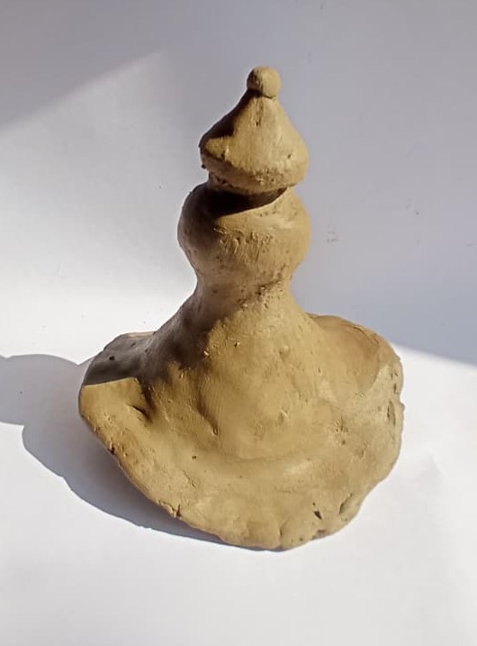
A clay model was developed to explore the selected perfume bottle's form, proportions, and sculptural details in a tangible way.
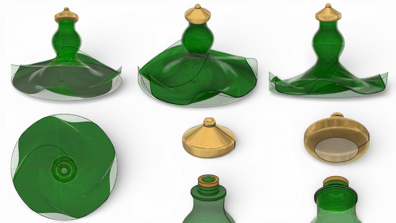
This section showcases the intricate structure and detailing of the perfume bottle design, captured through various angles of the digital 3D model.
High-quality renders were created to visualise the final perfume bottle design with realistic materials, lighting, and detailing — bringing the design closer to a real-world product.
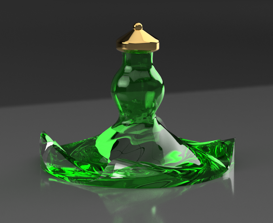
Front view render
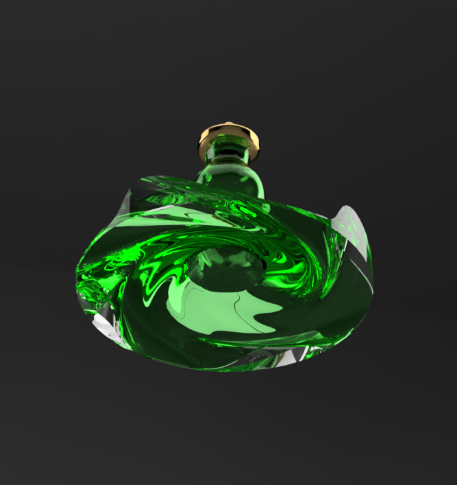
Bottom view render
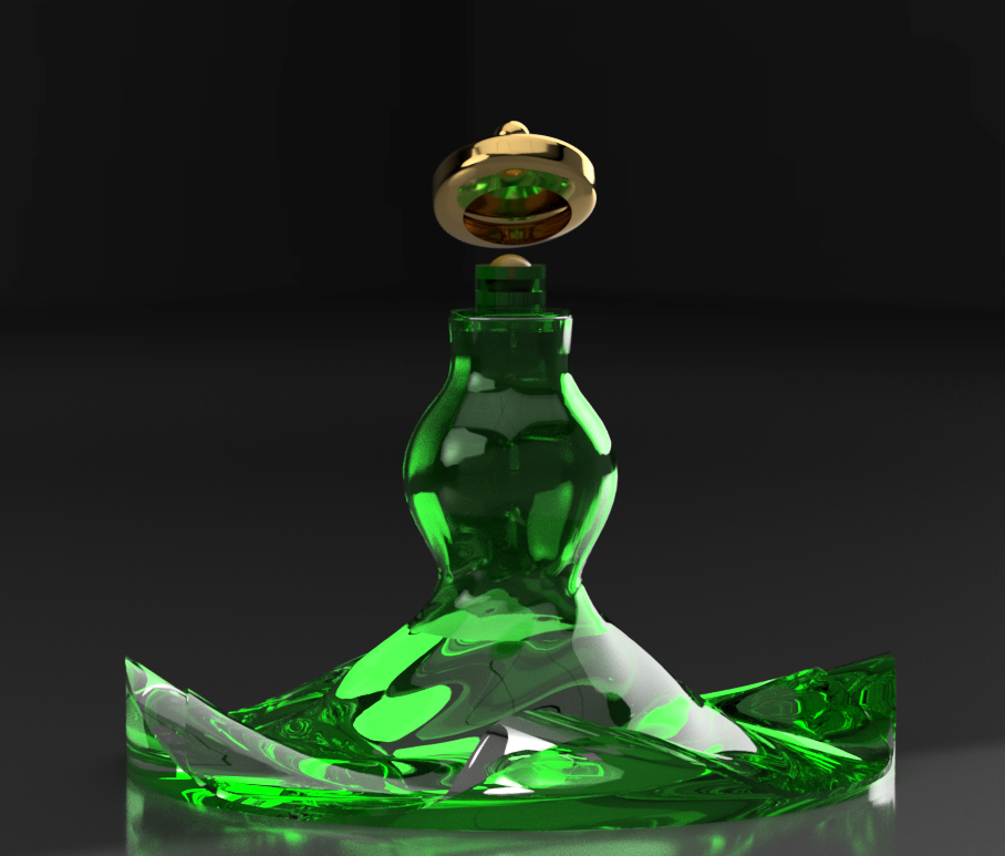
Open cap view
The twisting silhouette mirrors the spin of a ghagra — movement frozen in stillness, evoking Kathak's spiralling energy.
Every design decision maps back to Madhuri Dixit's persona — her grace, her era, and her deep cultural significance in Indian cinema.
Chosen for its graceful, deliberate application experience — one that feels as considered as the form itself.
The green & gold palette draws from the jewel-toned palette of Devdas — anchoring the product in Indian heritage and classical artistry.
Physical prototypes were fabricated to evaluate form, grip, and proportions in hand — validating the digital model against real-world scale and tactility.
Prototype — detail view
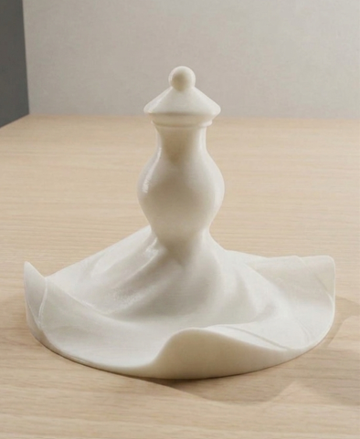
Prototype — initial form
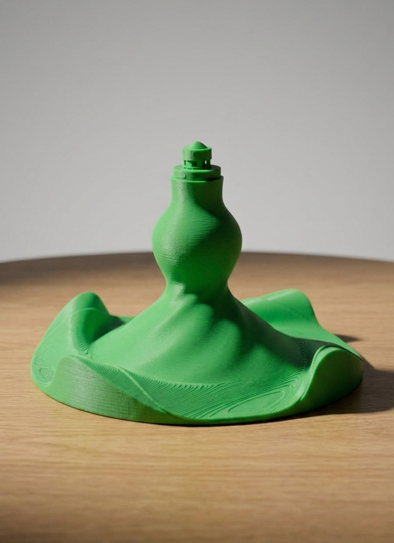
Prototype — body without cap
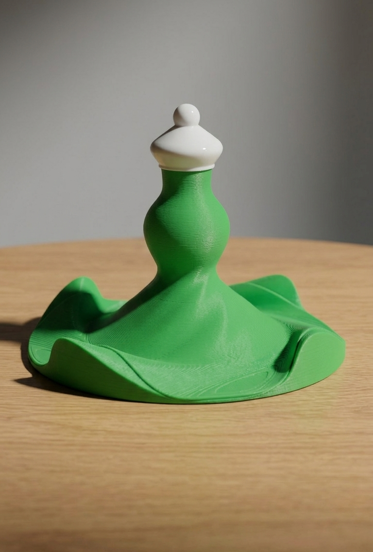
Prototype — assembled

Animated 360° product render
By translating Madhuri Dixit's artistry into form, material, and finish, the perfume bottle becomes more than a container — a statement of heritage, movement, and elegance.
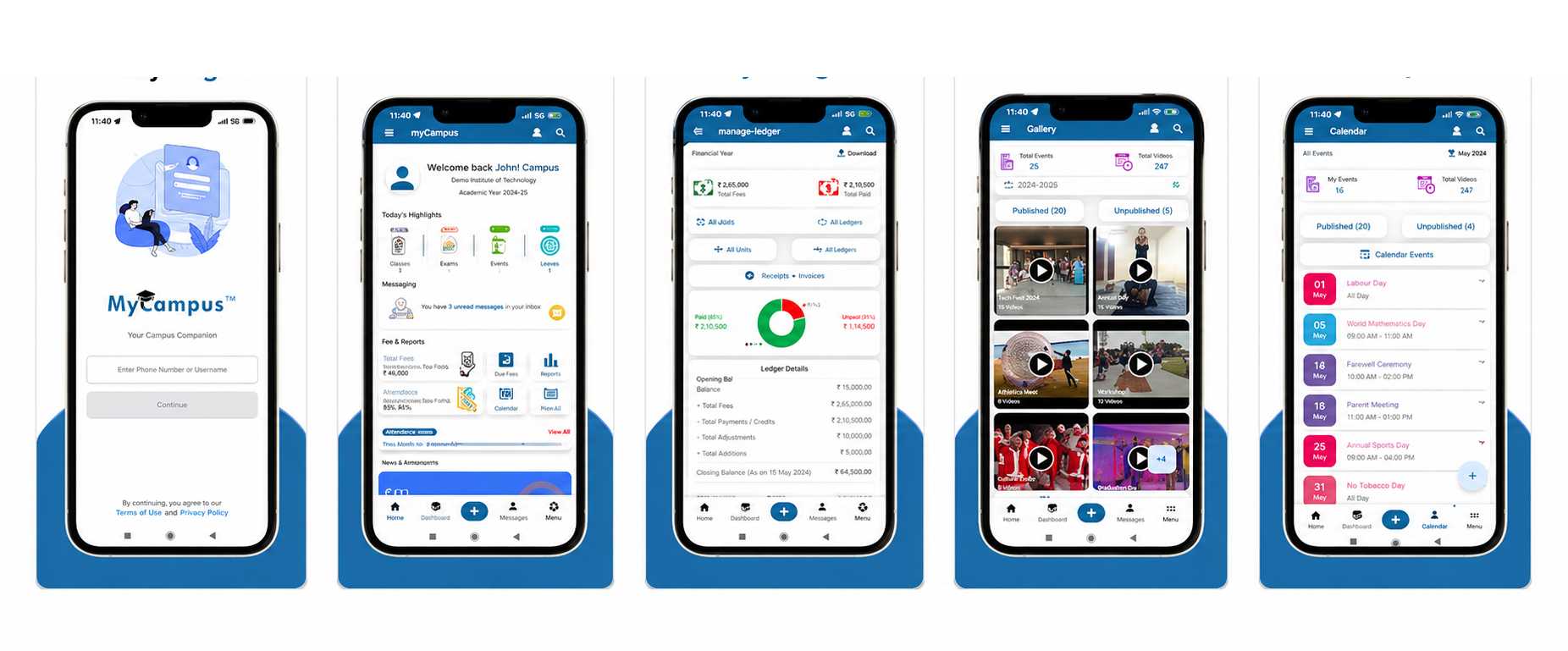
myCampus is an educational mobile application designed for parents and students of schools using the myCampus ERP platform. The app bridges the gap between school administration and home — giving parents real-time access to attendance, fee status, timetables, and announcements, all from a single interface. The app is live on the Google Play Store.
Product Designer — wireframes to final handoff during internship at myCampus.
Oct – Dec 2024 (internship deliverable)
Figma, Jira, Notion
Shipped — live on Google Play Store.
Research focused on understanding how parents and students currently interact with school information systems — identifying friction points, unmet needs, and expectations around a mobile-first experience.
Parents received updates via WhatsApp, phone calls, and printed slips — no single reliable source of truth for school information.
Parents were unsure about due dates, pending amounts, and receipts — leading to repeated trips to the school office for clarification.
Parents had no way to know if their child was marked present until end-of-day — causing anxiety and unnecessary communication overhead.
Students couldn't easily access their timetables or exam schedules on mobile — relying on physical planners or asking classmates.
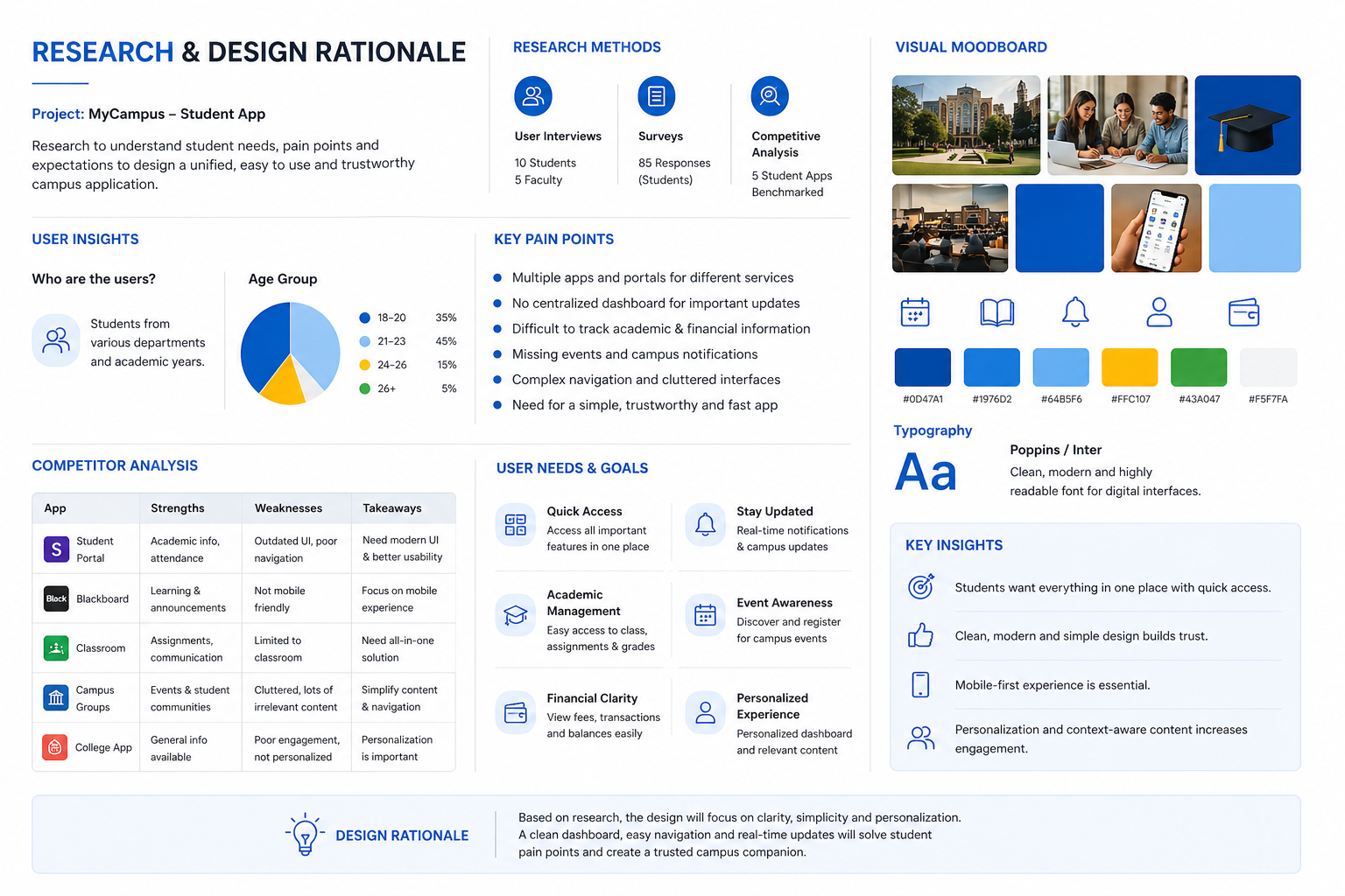
User research & contextual findings
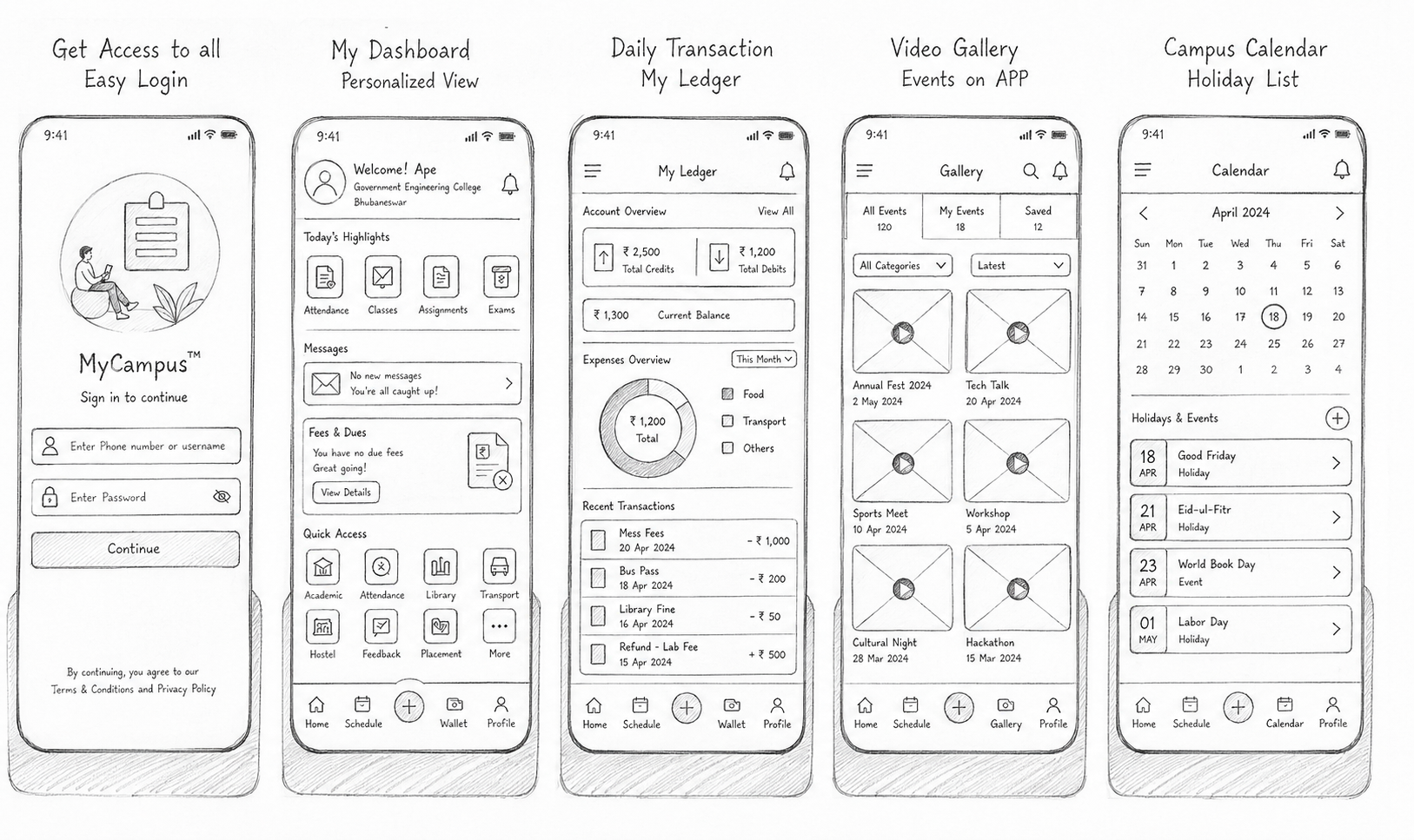
Pencil sketches — early layout exploration
Card-based home screen arrangements explored to surface key info at a glance.
Tab bar vs. hamburger menu compared for ease of one-handed use.
Tested icon-first and label-first hierarchy for non-technical parent users.
Iterated on calendar representations to make absence patterns instantly readable.
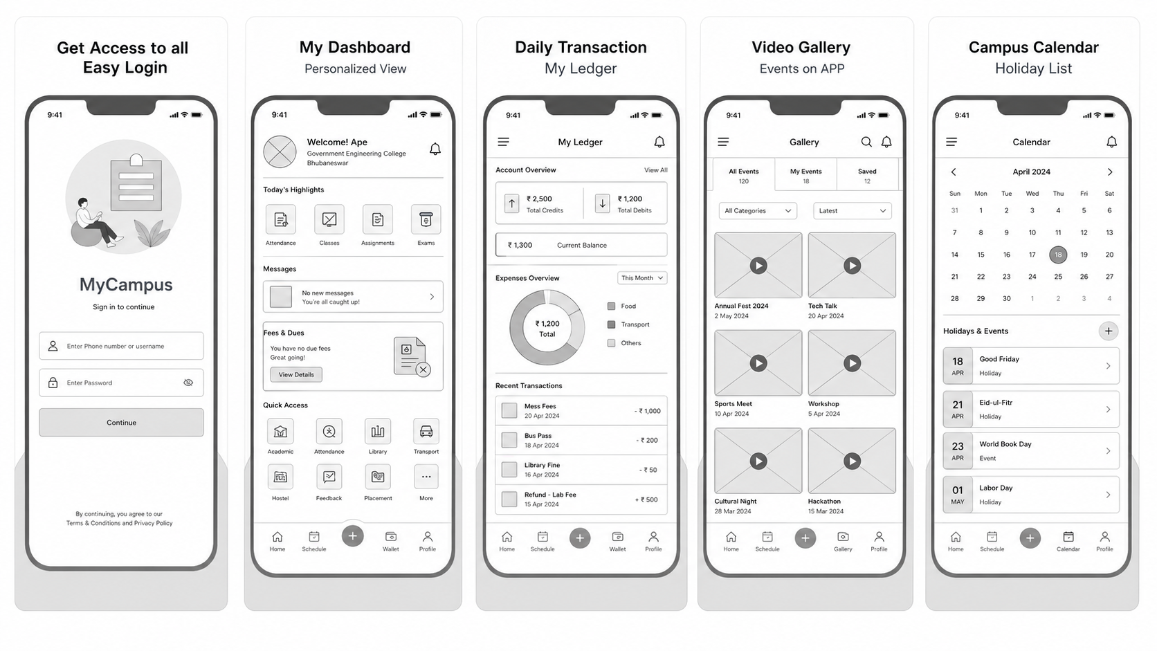
Low-fidelity wireframes — information architecture & layout validation
Status-at-a-glance cards — attendance, fees, and events within one tap.
Tab navigation for key modules keeps core actions always accessible.
Monthly calendar view with colour-coded present / absent states.
Clear pending amount and payment CTA — no office visit needed.
Home screen surfaces attendance, fee status, and upcoming events as summary cards — zero navigation required for daily checks.
Copy and UI labels written for non-technical parents — plain language, clear CTAs, no jargon.
High-contrast text, large tap targets, and readable font sizes designed for users across age groups.
Each module (Fees, Attendance, Timetable) is self-contained — allowing the ERP backend to enable/disable features per school without breaking layout.
The myCampus App demonstrates that even complex institutional data — attendance, fees, timetables — can be made effortlessly readable for everyday parents. By prioritising clarity and reducing friction, the app became a trusted daily touchpoint for thousands of families.
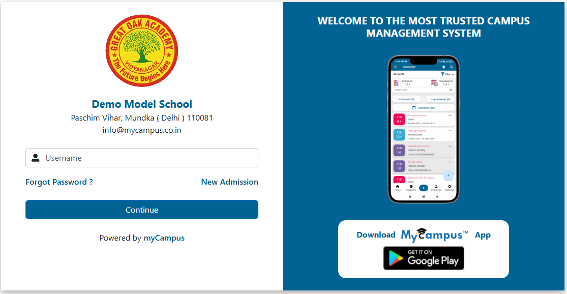 Login
Login
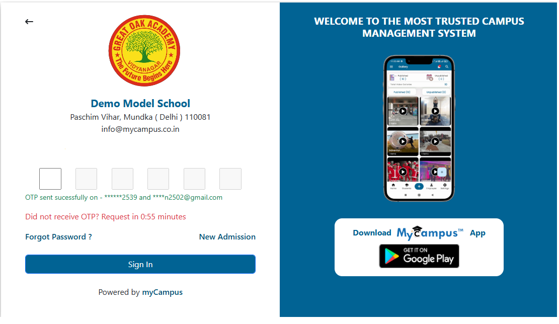 OTP
OTP
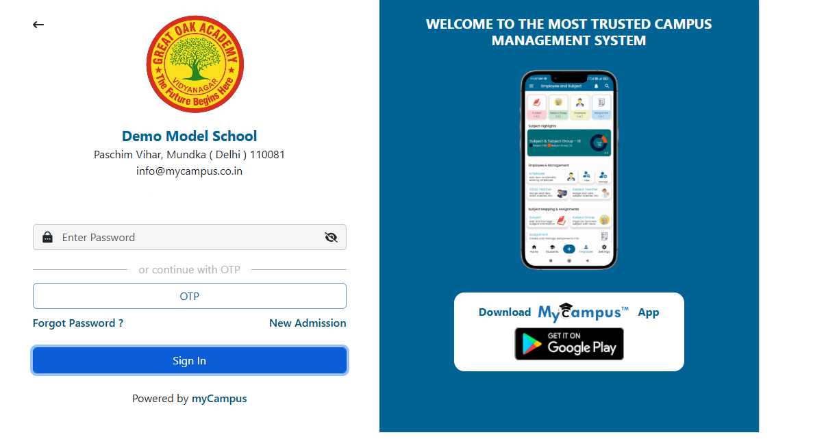 Password
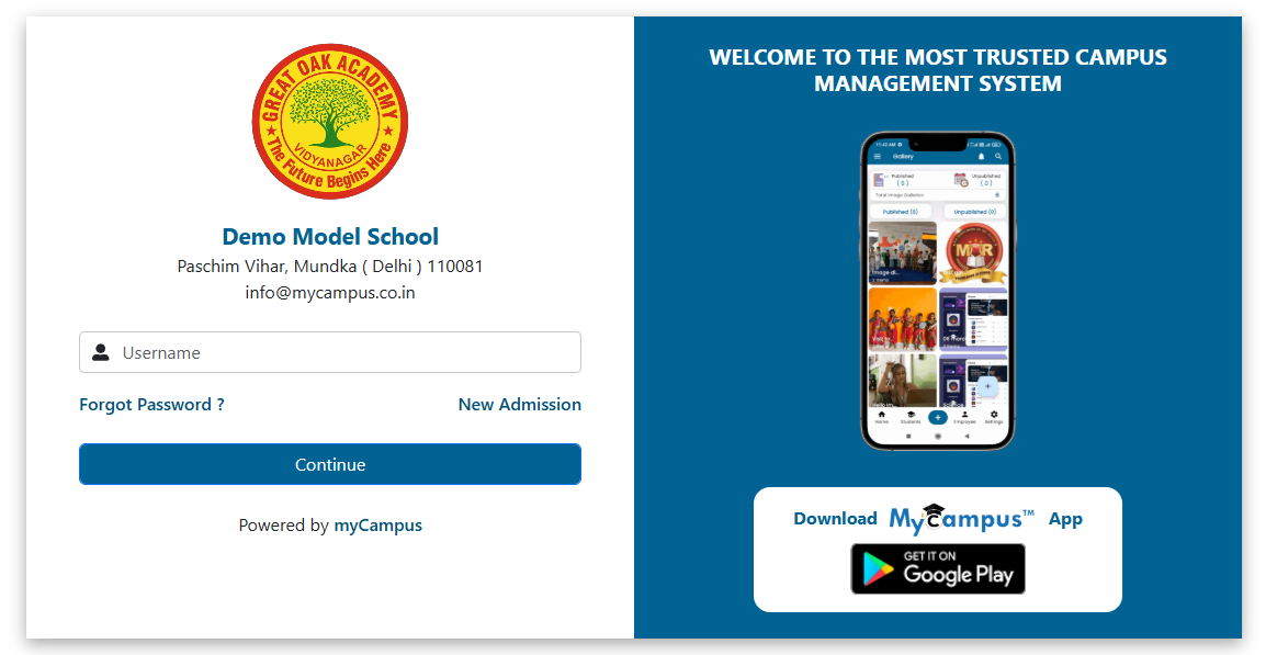
A clean, branded login experience for the myCampus ERP web platform. The design addresses three entry points — standard login, OTP-based login, and password-based login — within a unified, consistent UI that reflects the institution's identity.
Product Designer — end-to-end from research to final screens.
Web application — desktop-first, responsive.
Figma, Photoshop
Login, OTP verification, and password screens.
Analysed pain points in existing ERP login flows — confusing field labels, no visual hierarchy, lack of brand identity, and poor error-state feedback. Benchmarked against leading SaaS login patterns to identify best practices.
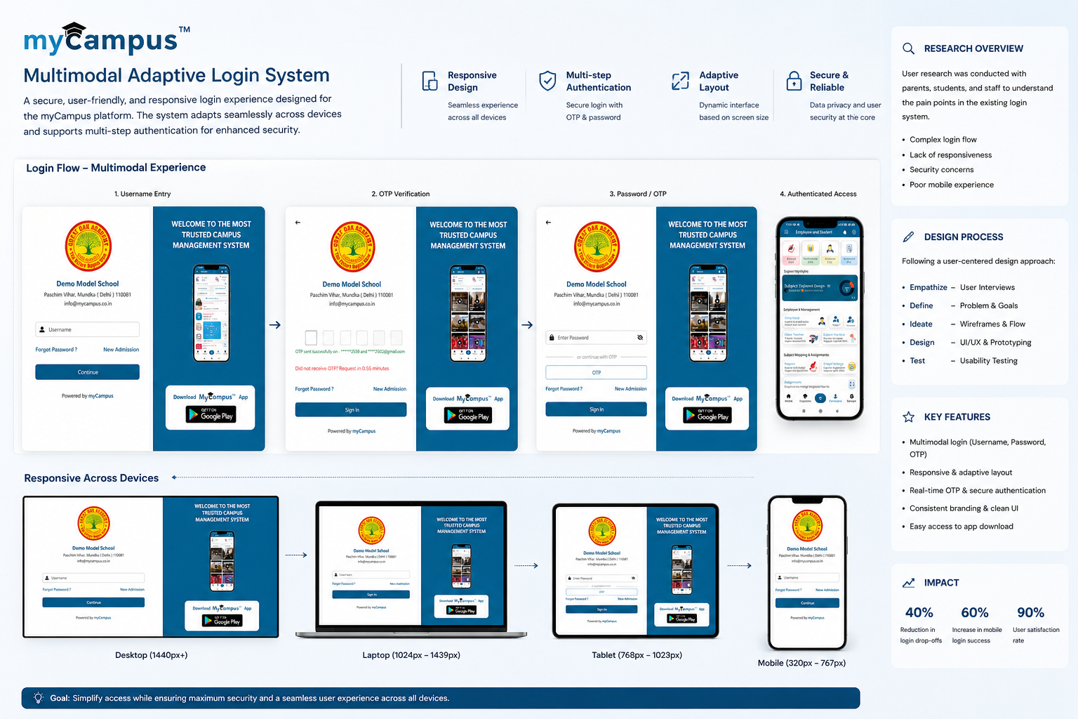
Competitive research & pain-point mapping
Explored multiple layout directions — split-screen with brand imagery, minimal centered card, and full-bleed gradient backgrounds. Evaluated each against clarity, trust-building, and brand alignment.
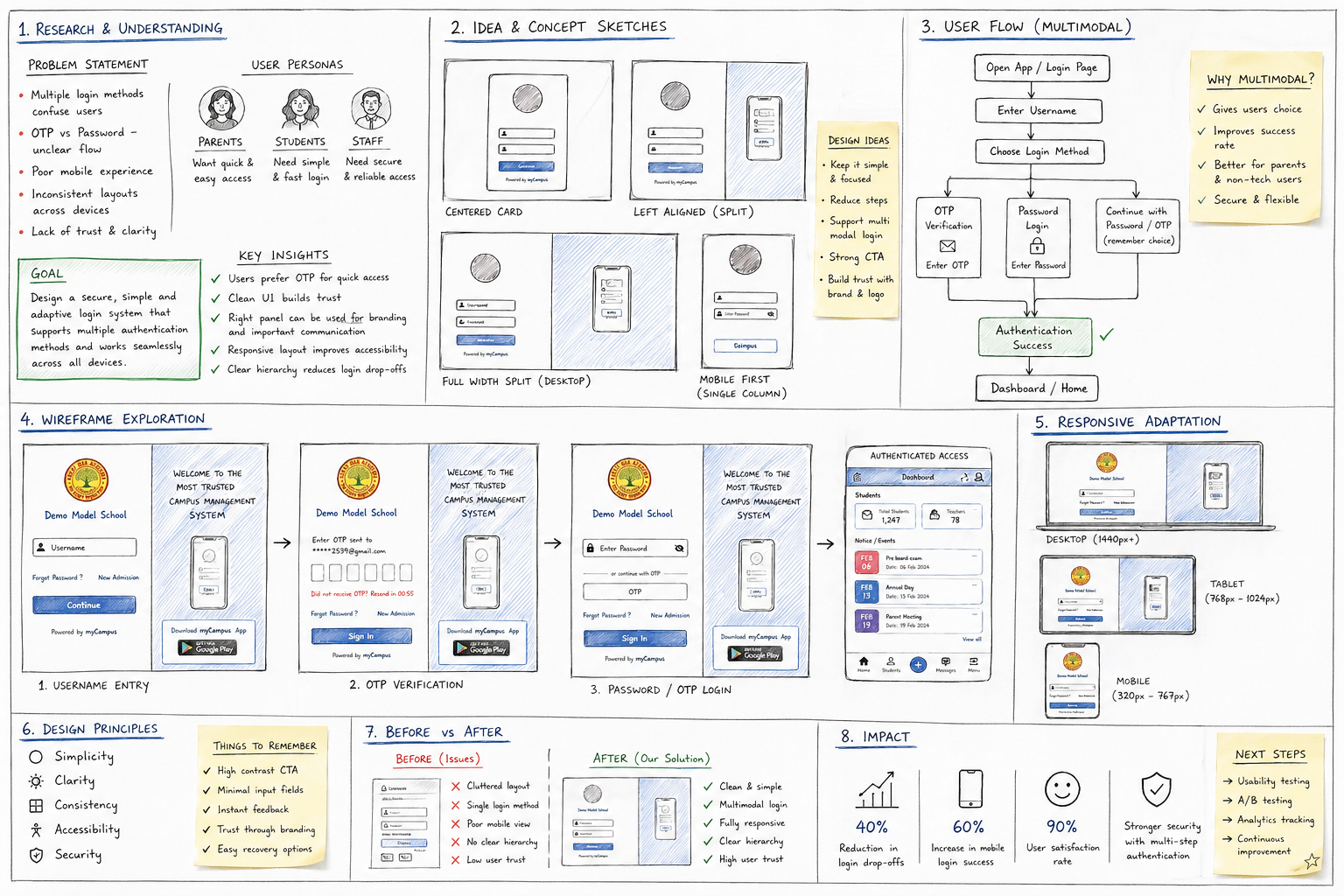
Layout explorations & direction selection
Low-fidelity wireframes defined the layout structure, field order, CTA placement, and the multi-step auth flow across all three screens before any visual styling was applied.
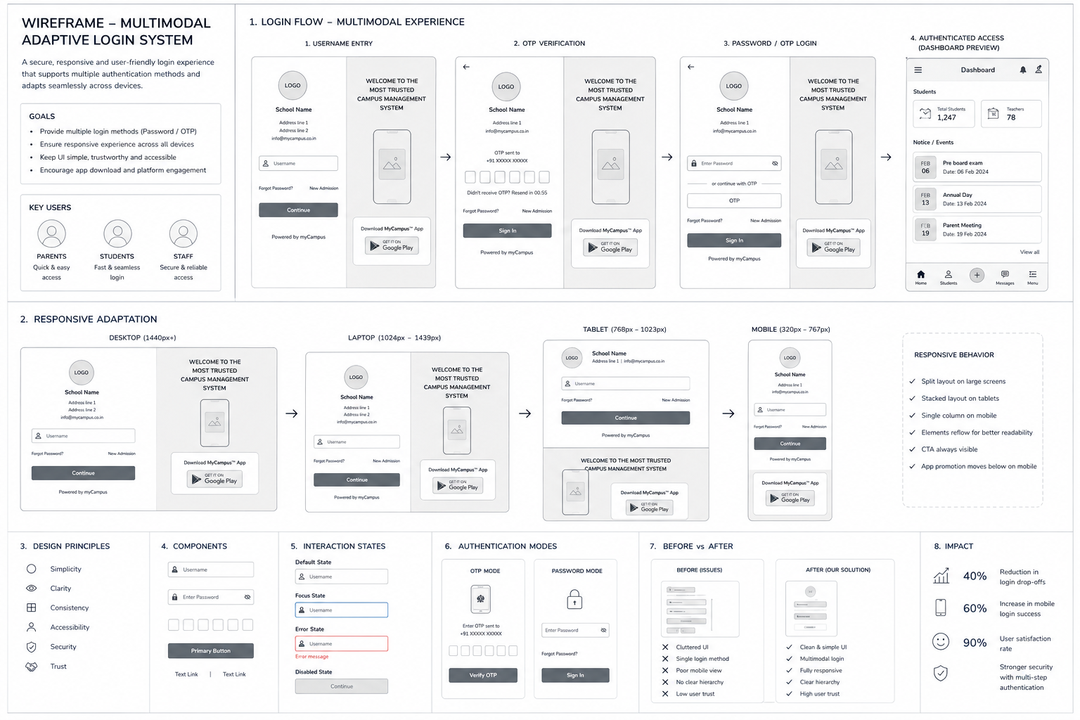
Wireframes — information architecture & layout
Three polished screens delivering a unified auth experience — each optimised for its specific task while maintaining consistent visual language.
Login — main entry screen
Login with OTP — one-time password verification
Login with Password — password-based authentication
A login interface that balances brand identity with functional clarity — reducing friction at the most critical touchpoint of the ERP system. Three distinct auth paths, one cohesive experience.
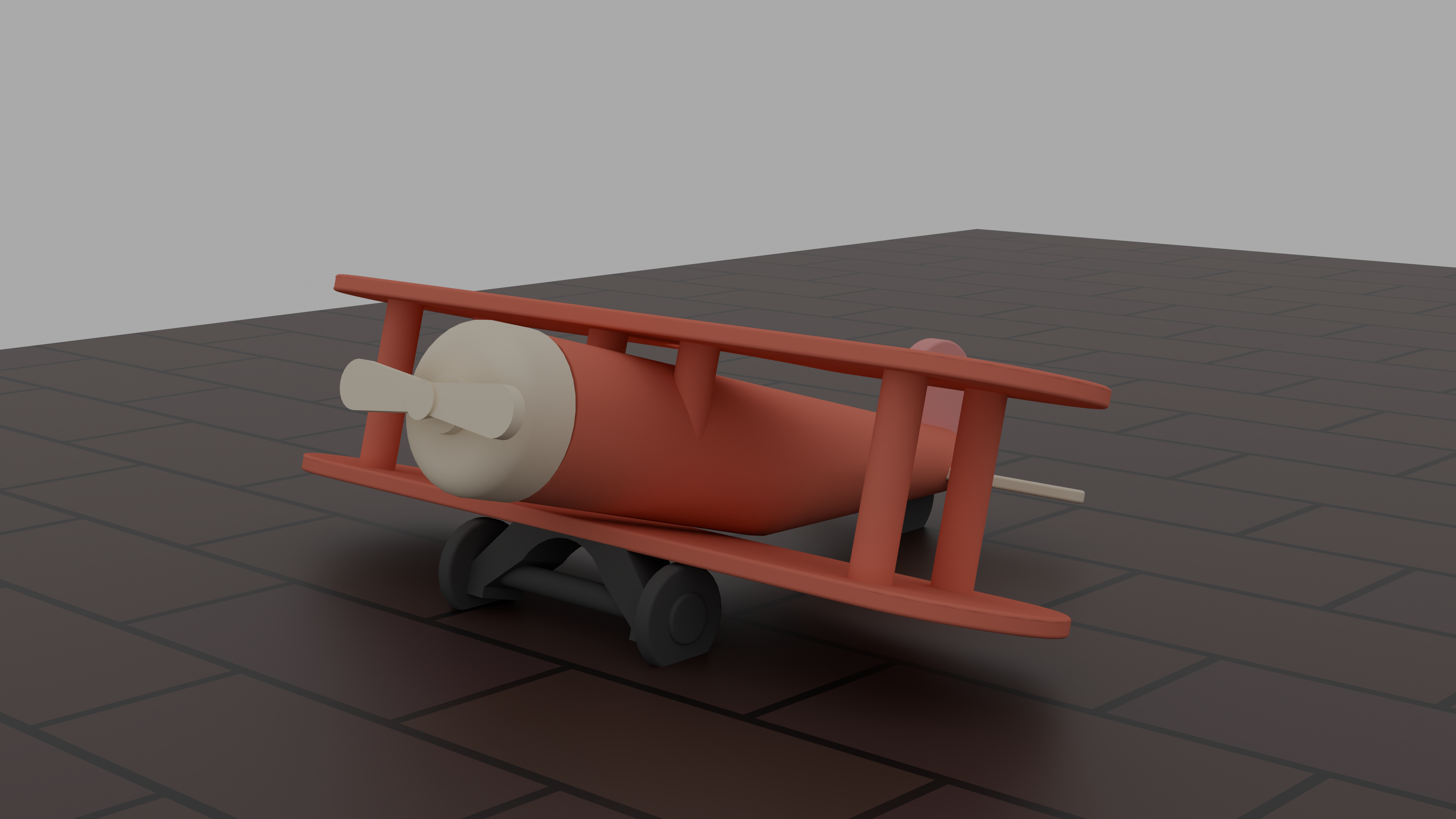
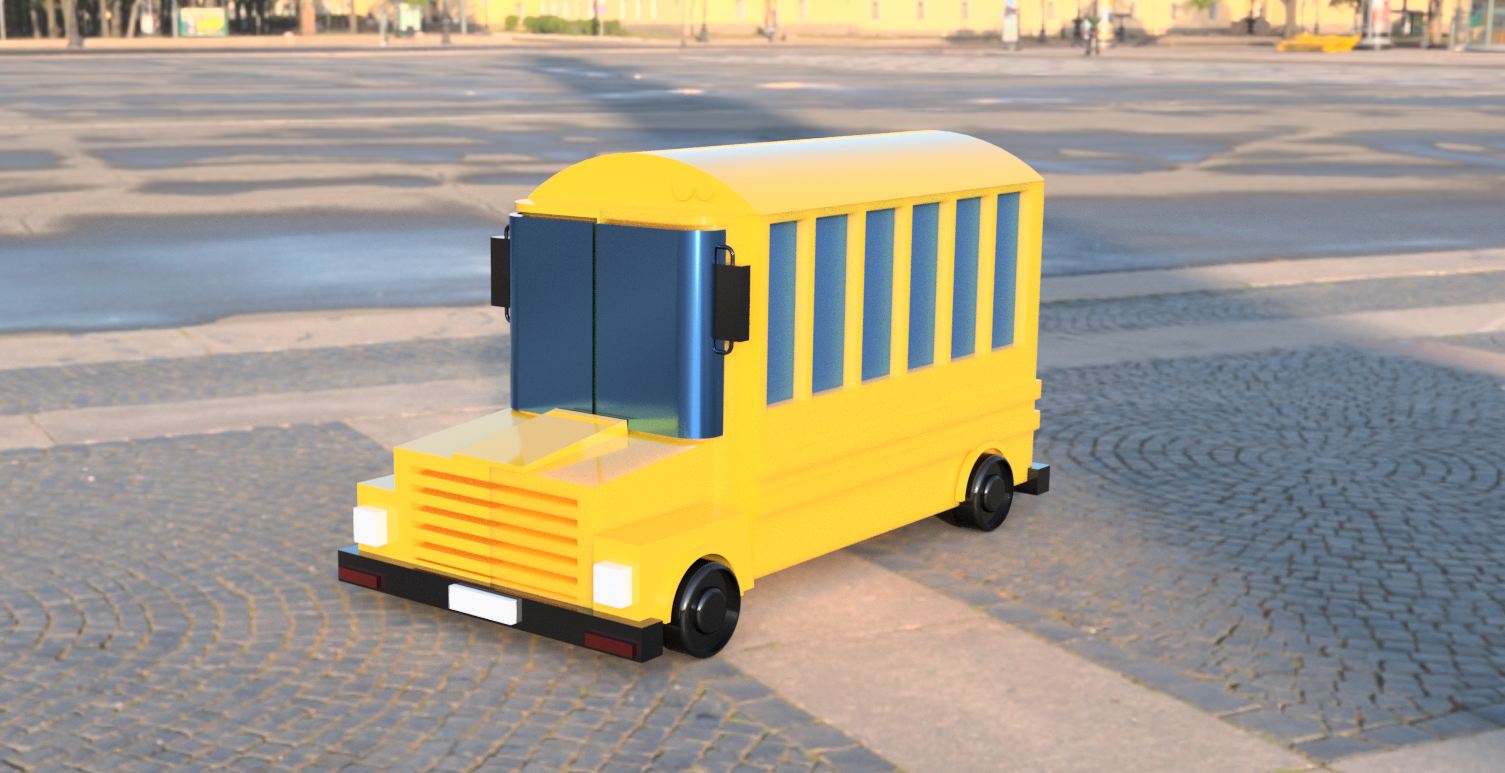
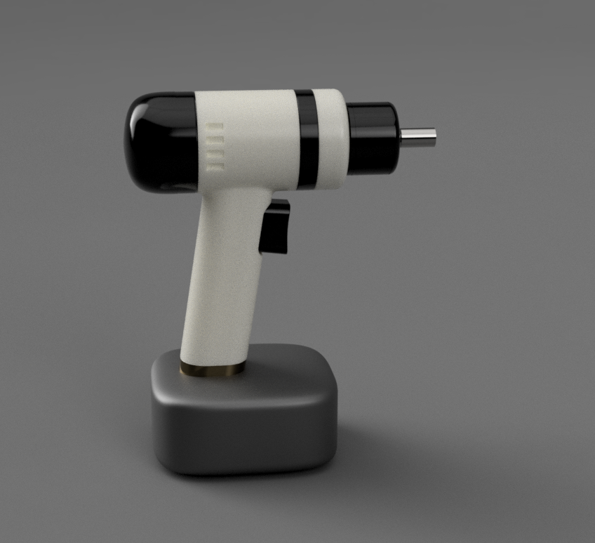
A collection of precision 3D CAD models — toy vehicles, full-scale vehicles, and industrial machinery — each rendered from multiple views to document form, proportion, and mechanical structure.
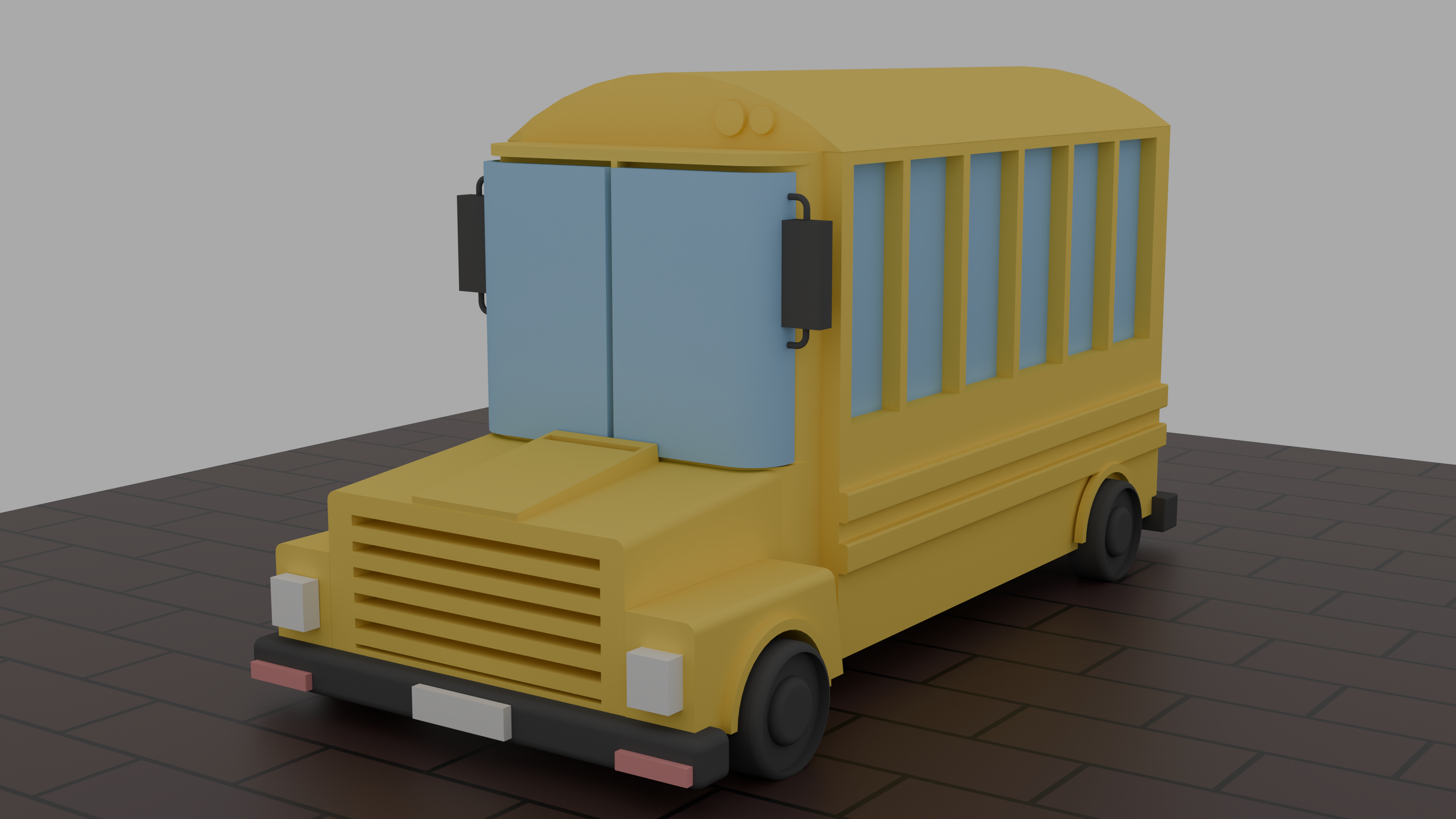 Toy Bus
School Bus — Front
Toy Bus
School Bus — Front
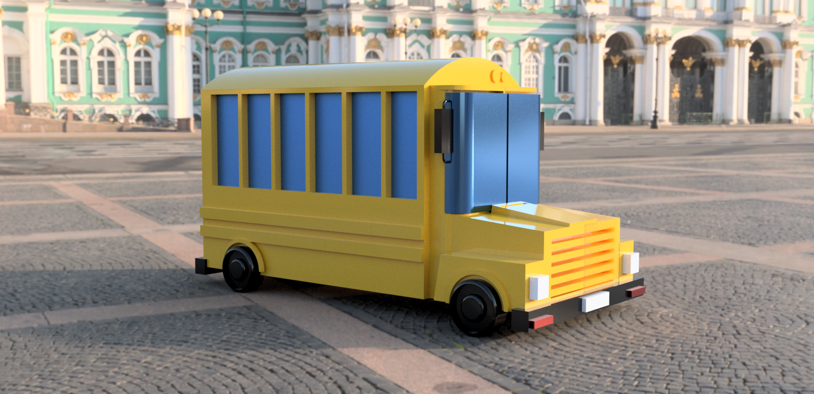 School Bus — Side
Toy Aeroplane — Isometric
School Bus — Side
Toy Aeroplane — Isometric
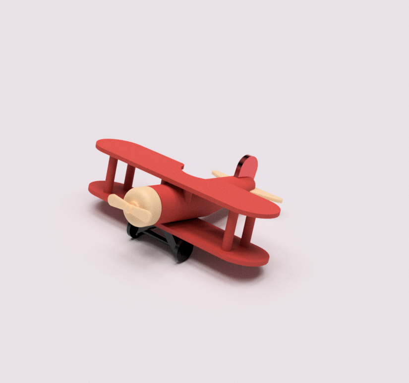 Aeroplane — Front View
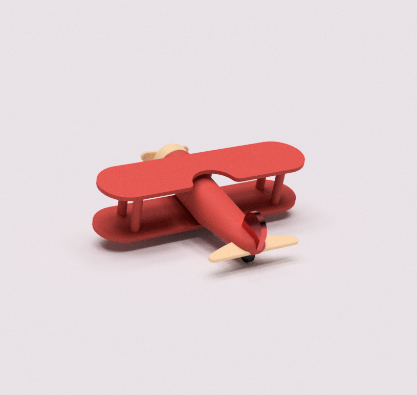 Aeroplane — Back View
Assembly View
Aeroplane — Back View
Assembly View
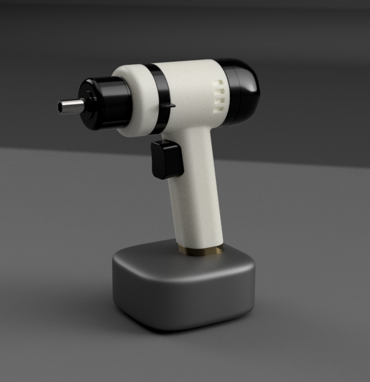 Side View
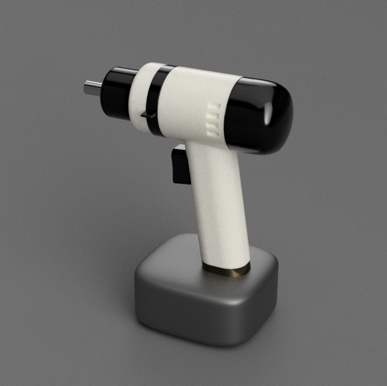 Rear View
These models sharpened spatial reasoning and proportional thinking — skills that directly inform how I approach physical product design today.
Modelling in 3D builds a discipline of thinking in three dimensions — understanding volume, surface continuity, and mechanical fit before a single physical prototype is made.
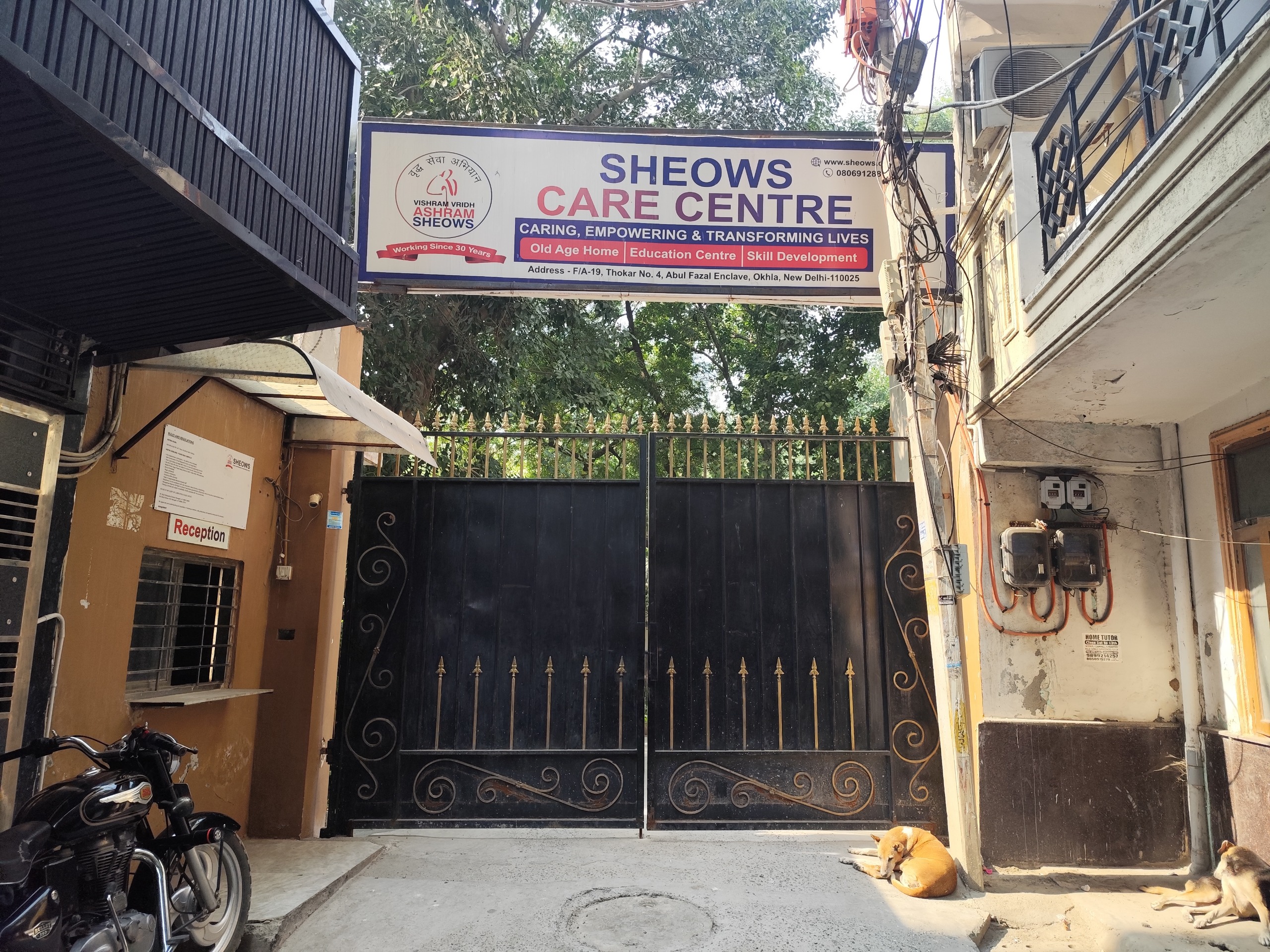
Many elderly residents in old age homes experience loneliness and emotional isolation despite having their basic needs fulfilled. This project explored how creative activities could encourage self-expression, social interaction, and a stronger sense of belonging among residents at SHEOWS Care Centre, New Delhi.
Explore how creative engagement can improve emotional well-being among residents.
Create opportunities for residents to express memories, thoughts, and emotions freely.
Design activities that bring residents together through shared creative experiences.
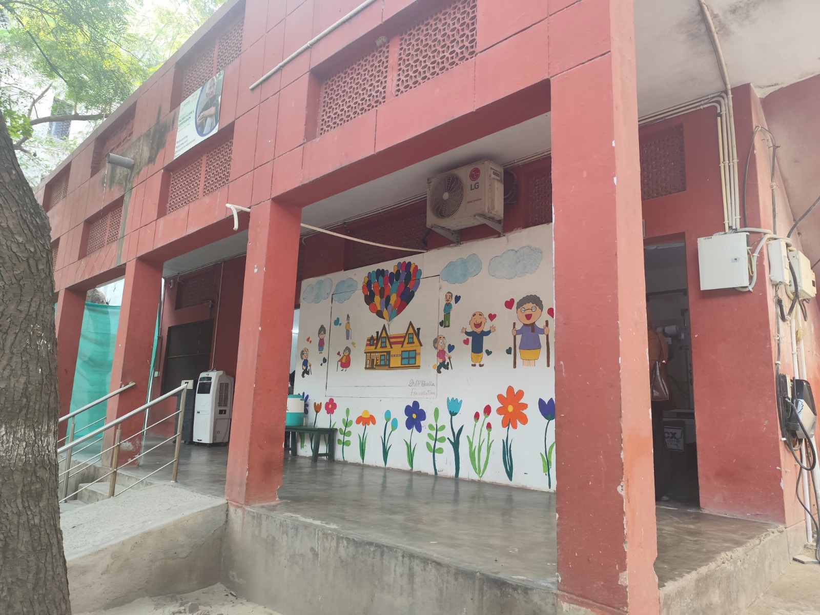
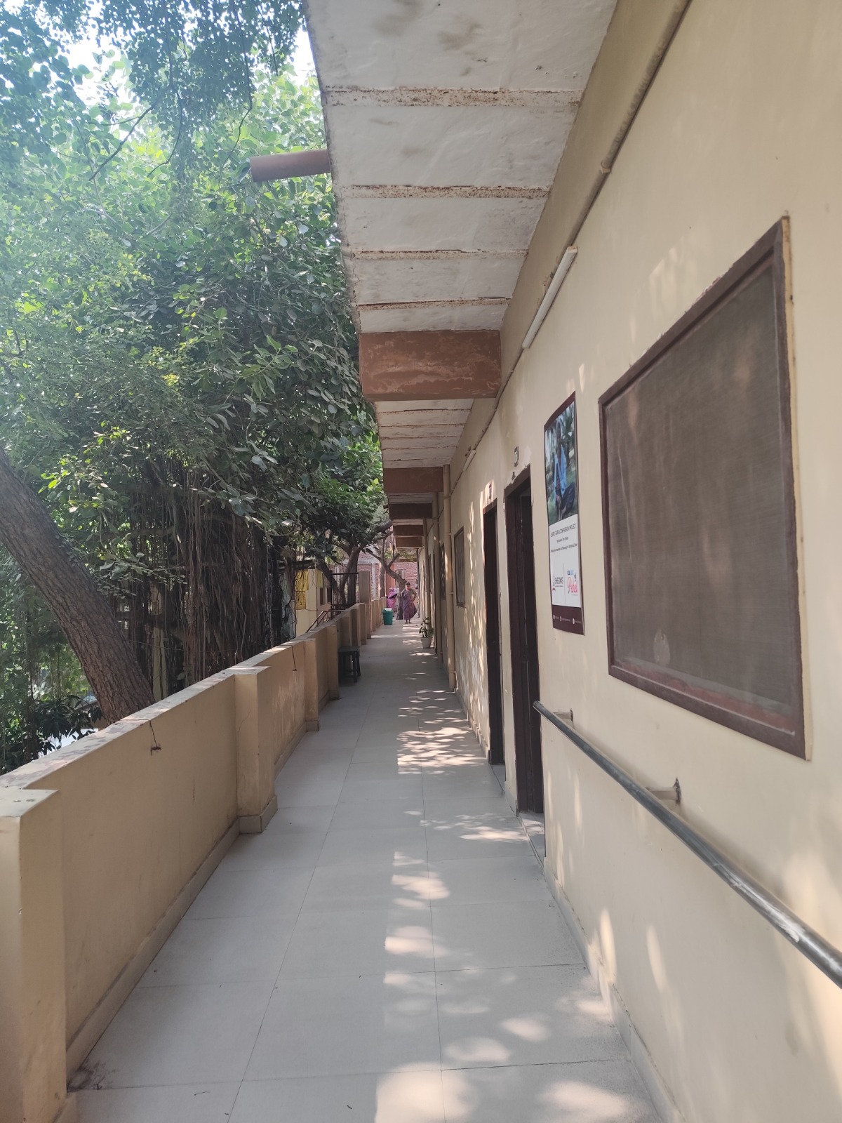
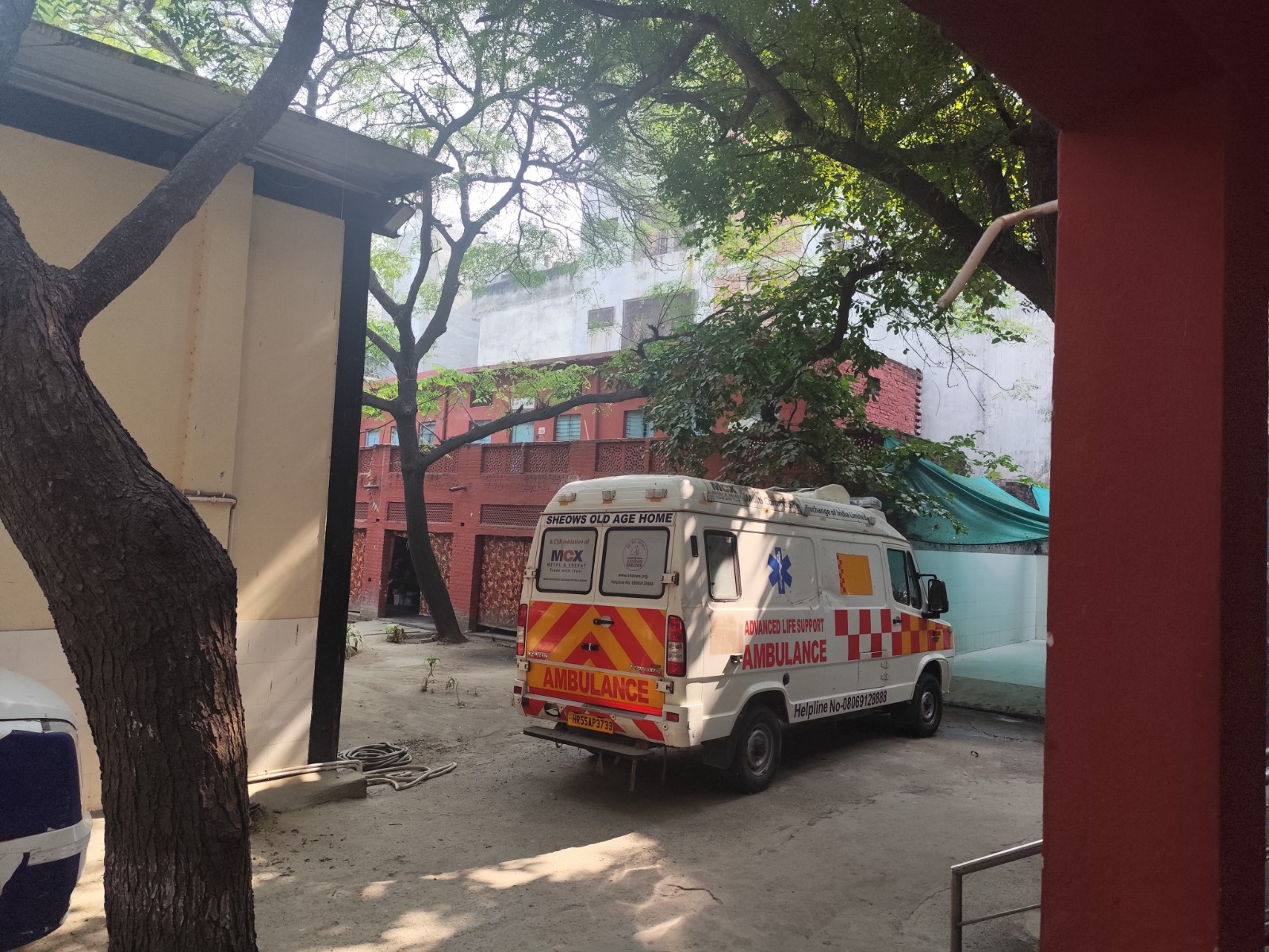
We conducted ethnographic observation, informal conversations, and field visits to understand the daily experiences of residents at SHEOWS Care Centre.
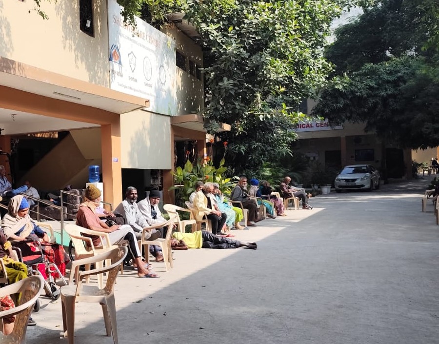
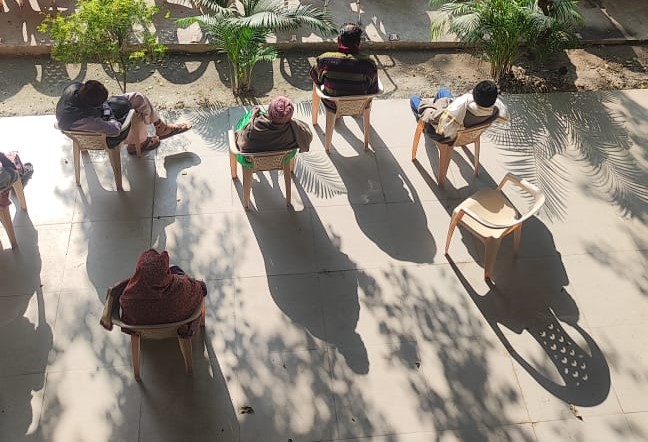
Residents had minimal meaningful interaction with each other despite sharing the same living space daily.
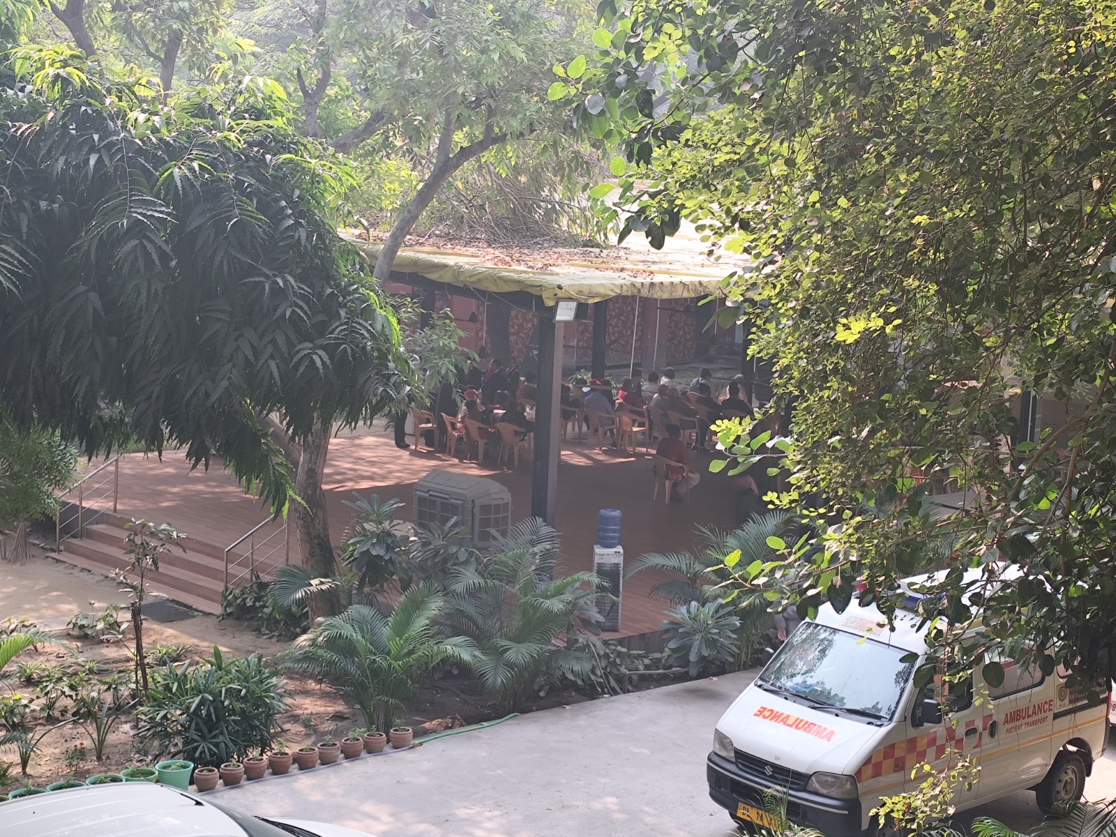
Daily schedules were monotonous, offering few opportunities for creative or social stimulation.
Feelings of loneliness and emotional isolation were prevalent even in a communal care setting.
Residents expressed a strong desire for meaningful engagement and purposeful daily activities.
 Field observation
 Informal conversations
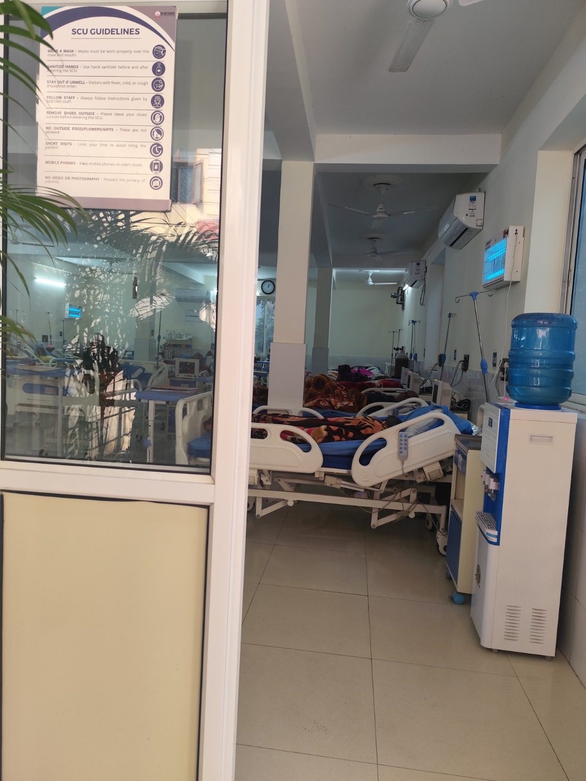 Daily routine study
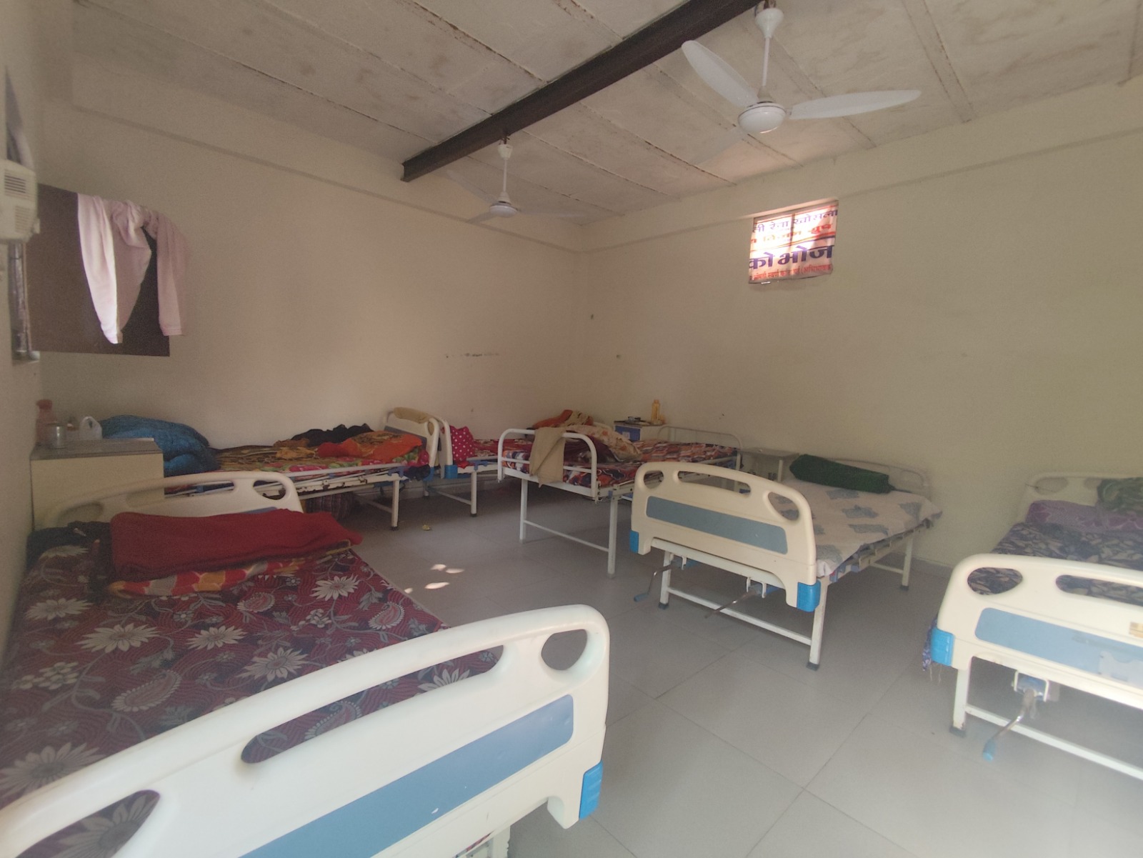 Community space
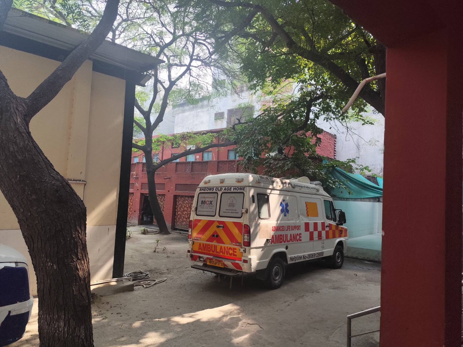 Ethnographic visit
Resident interaction
Ethnographic visit
Resident interaction
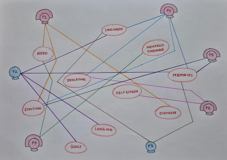
Network diagram mapping emotional & behavioural patterns
A network diagram was created to map emotional and behavioural patterns observed among participants (P1–P7) during field visits. Participants were connected with recurring emotional themes:
This mapping guided the development of meaningful engagement activities tailored to identified emotional relationships.
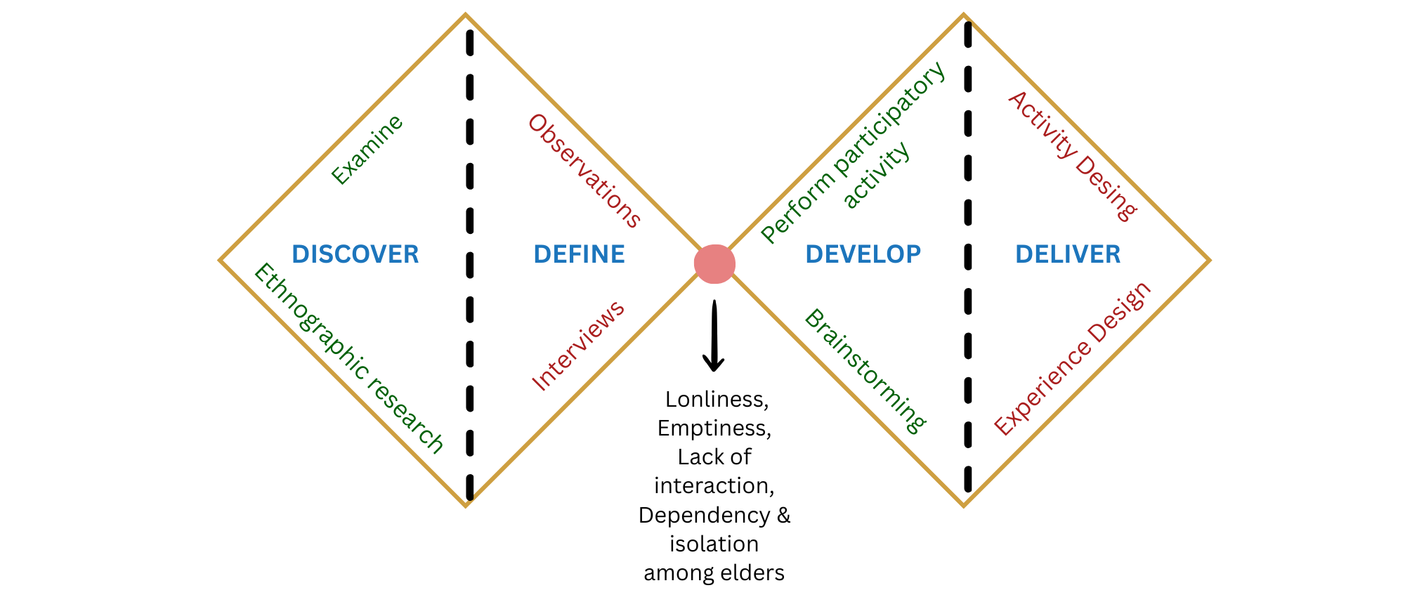
Double Diamond framework — explore, define, develop, deliver
Using the Double Diamond framework, we explored the problem space, identified key emotional needs, developed creative interventions, and tested them through participatory activities with residents.
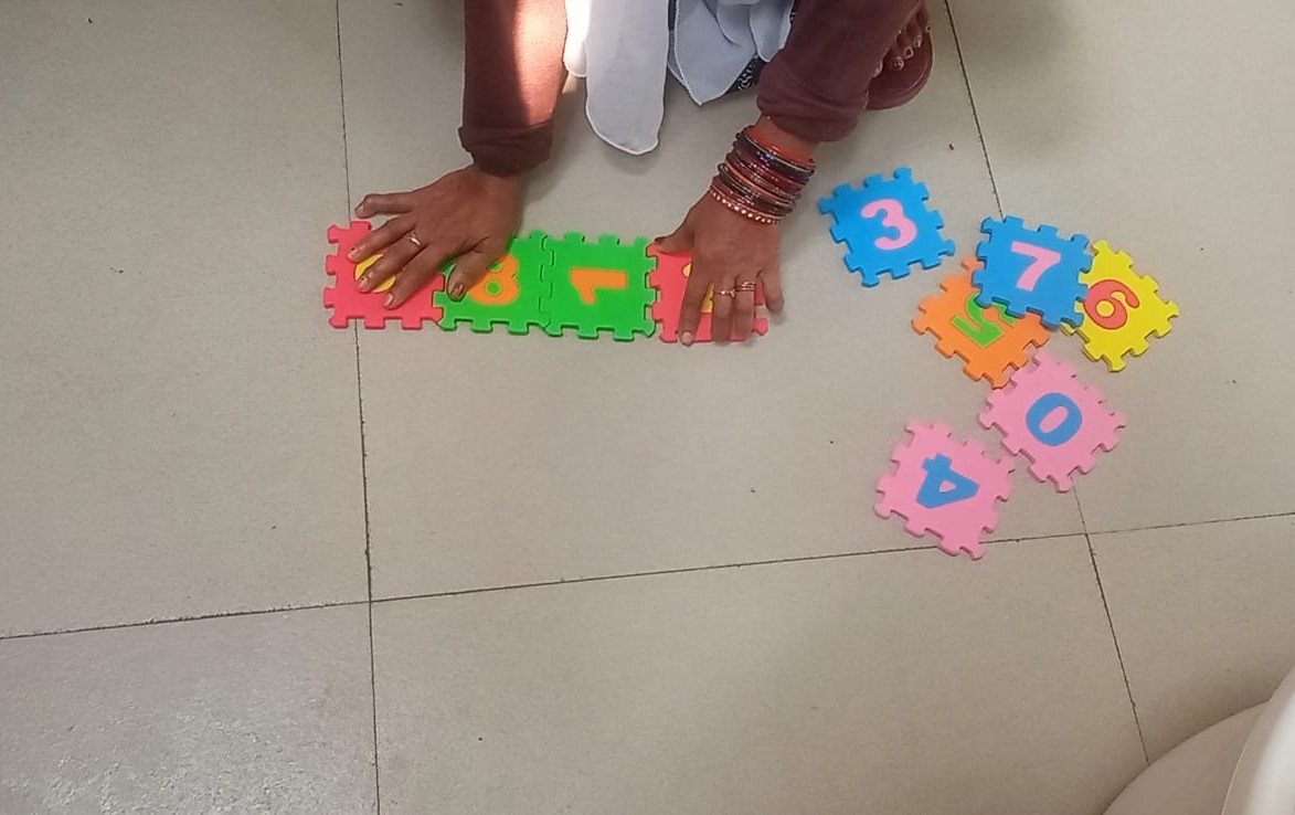
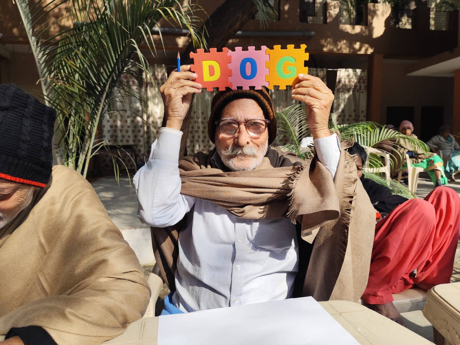
Before introducing the final intervention, we introduced colourful alphabet and number puzzles as a simple engagement tool to observe participation, interaction, and collaboration among residents.
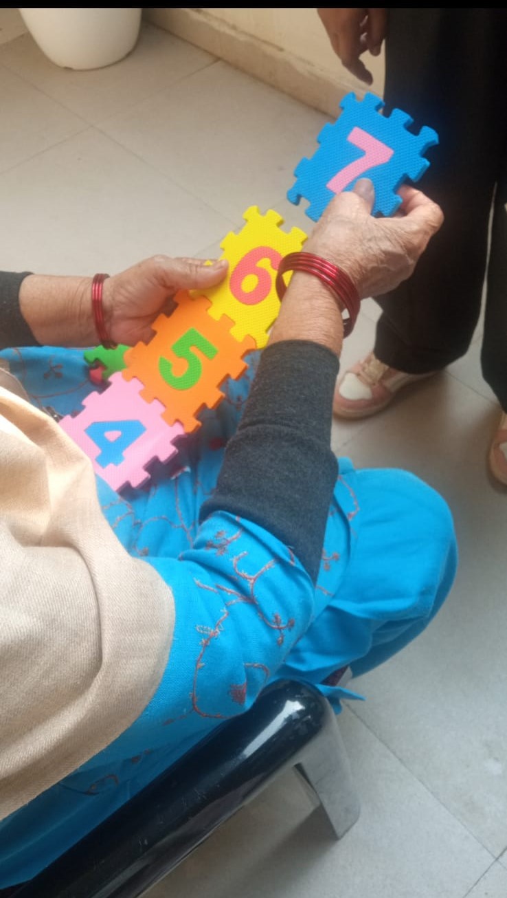
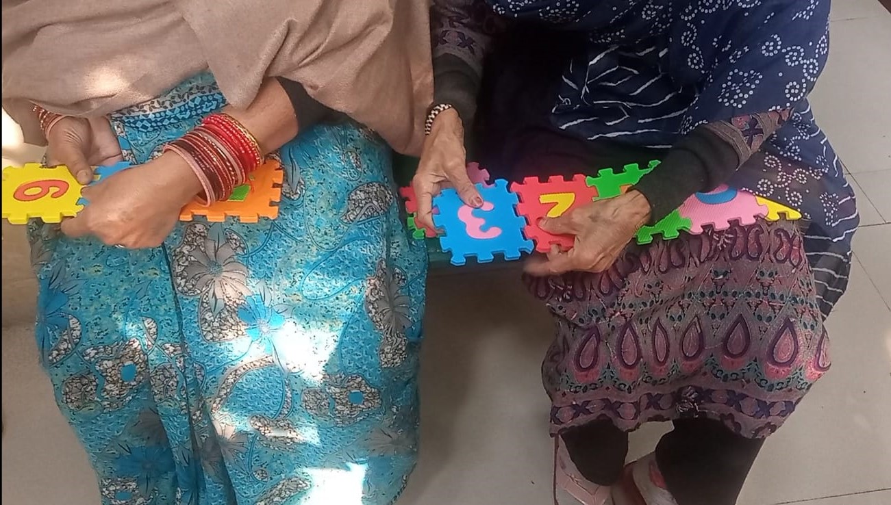
Pilot puzzle activity — testing participation
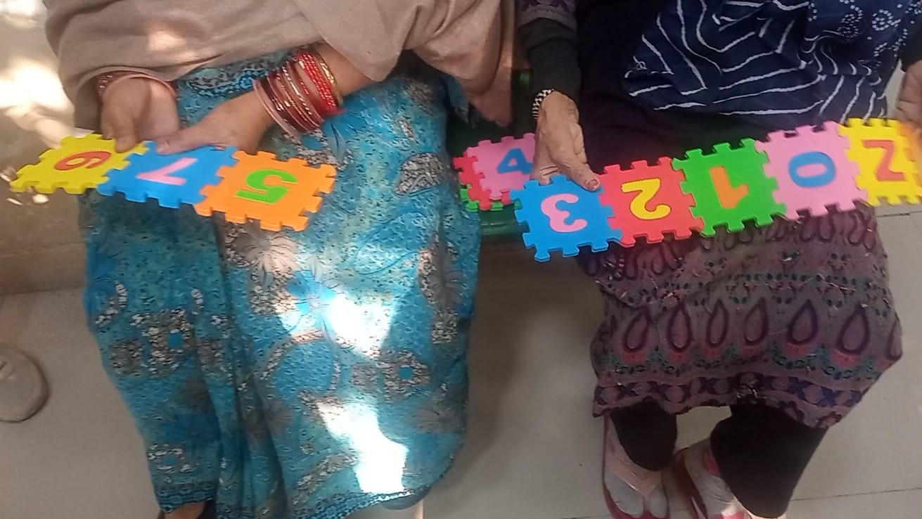 Group participation
Collaborative solving
Group participation
Collaborative solving
 Natural conversations
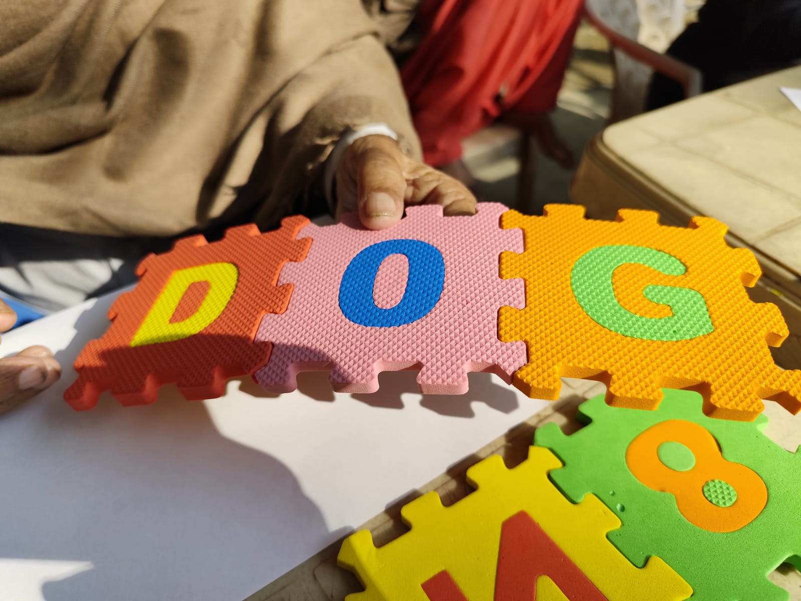 Growing engagement
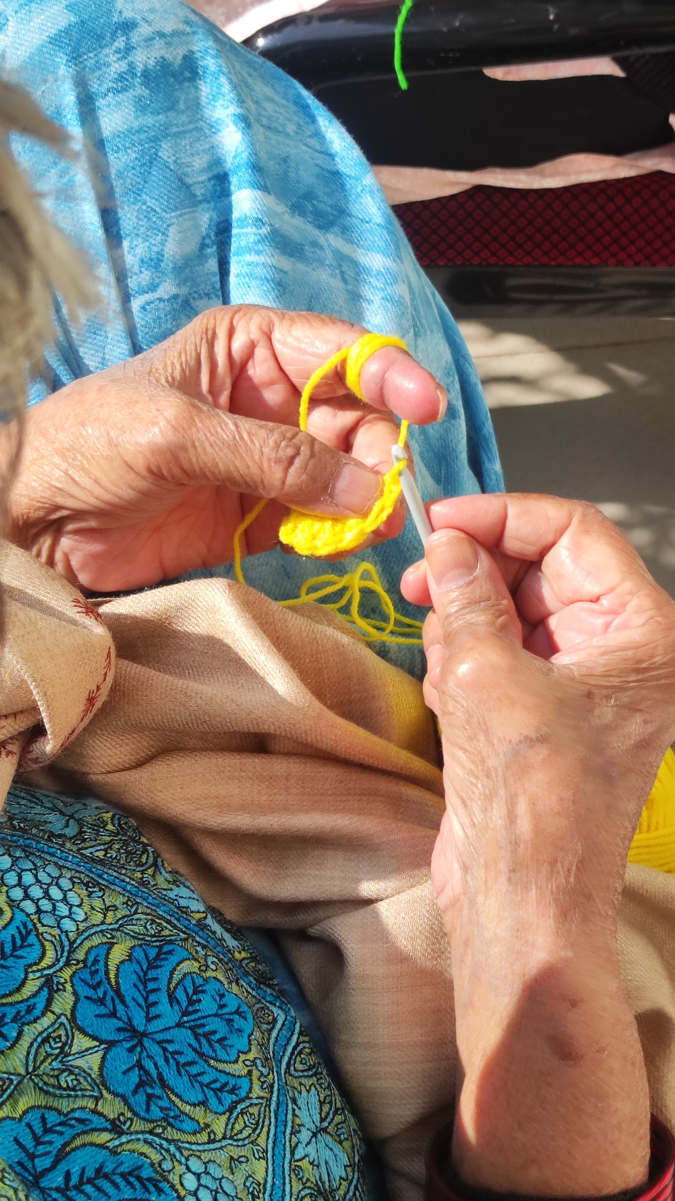
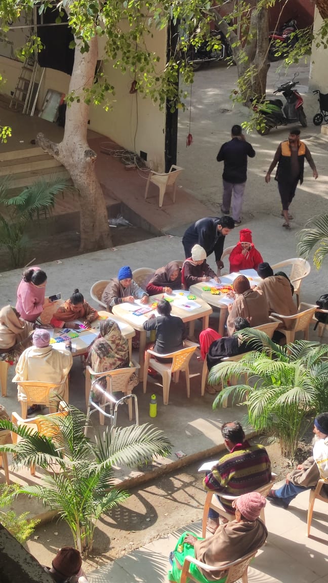
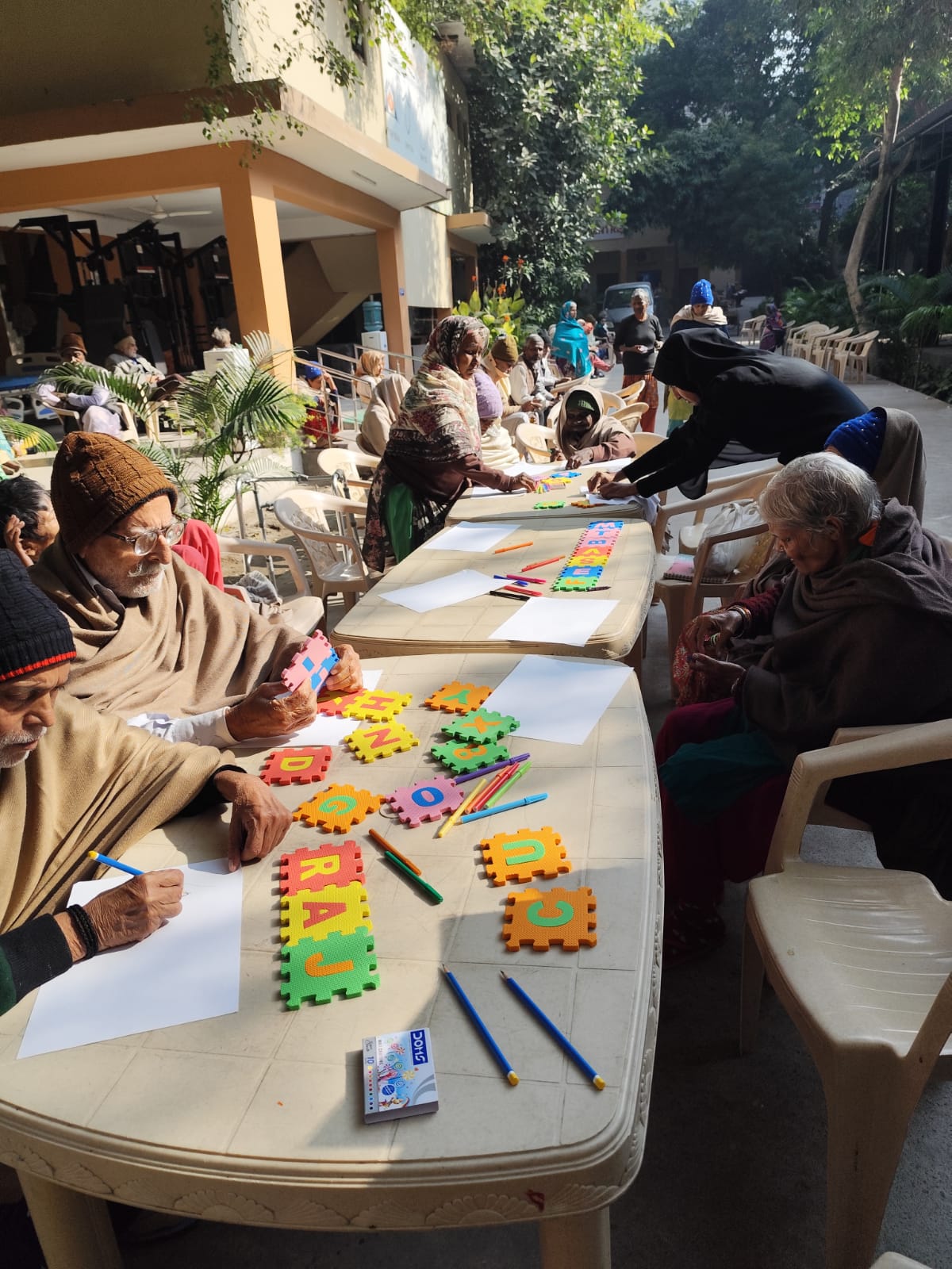
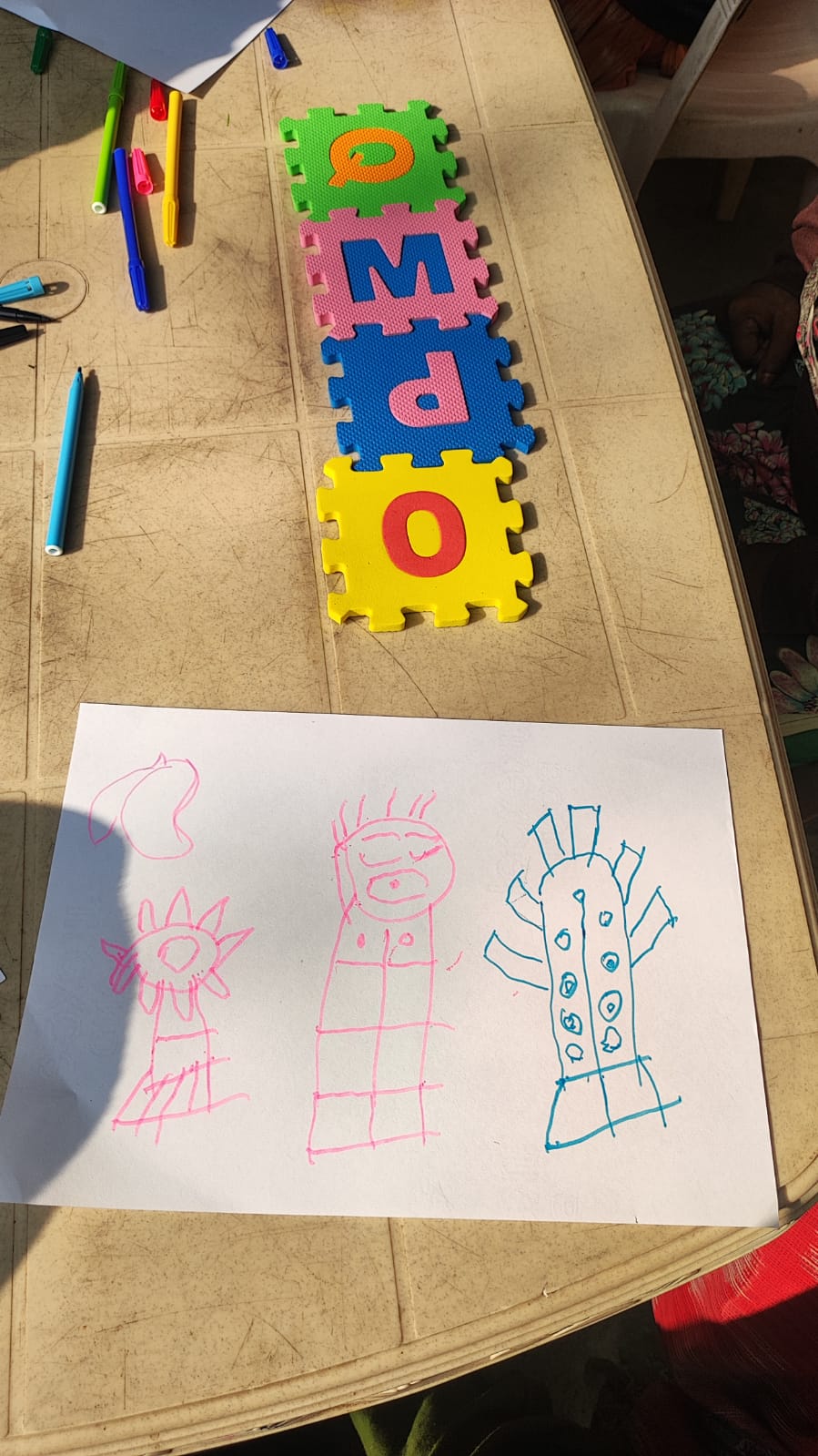
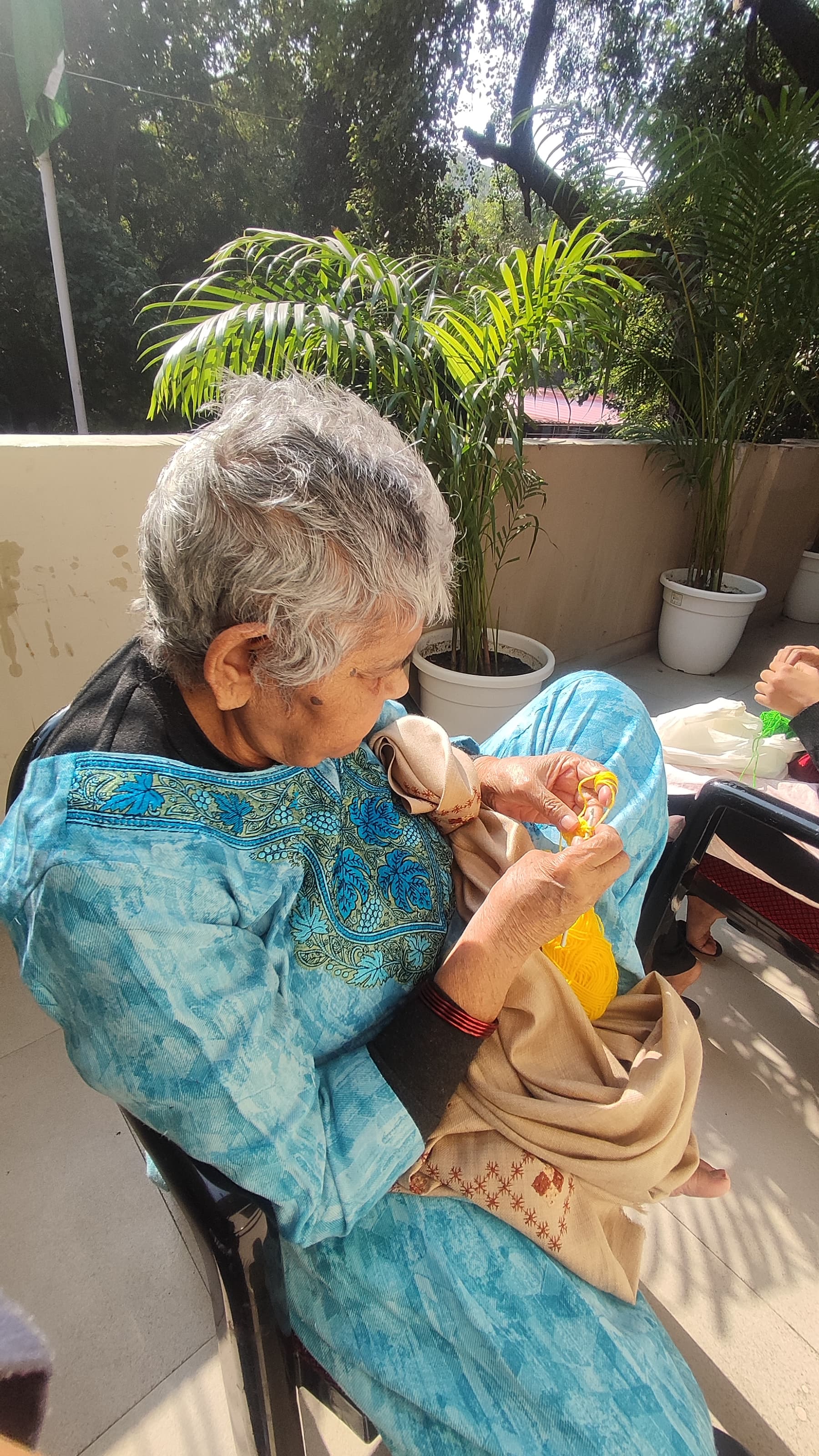
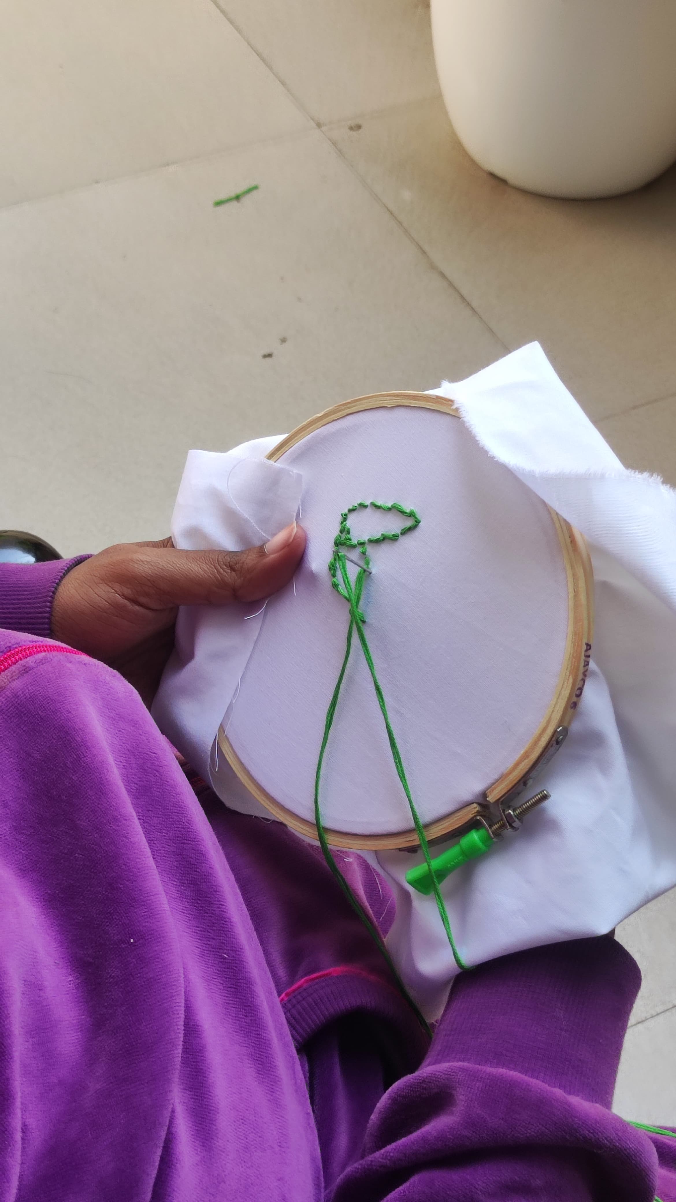
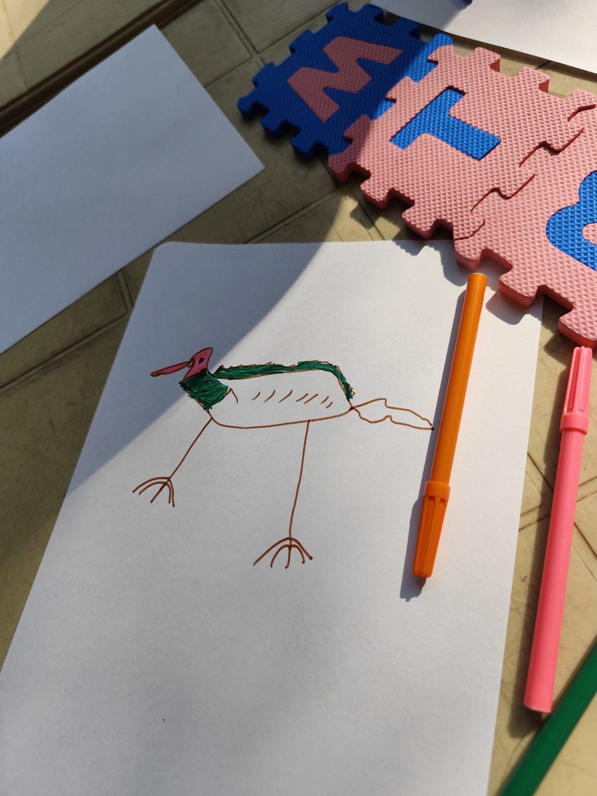
Building on insights from the pilot activity, we designed an open-ended creative space where residents could express themselves freely. Participants were provided with paper, colours, pencils, embroidery threads, and crochet materials — allowing them to engage according to their interests, skills, and experiences.
Residents reconnected with childhood memories through free-form drawing and colouring.
Emotional expression through written and spoken poetry in their native language.
Skill-based activities that reignited pride in traditional craftsmanship.
Group storytelling sessions created bonds and surfaced rich life histories.
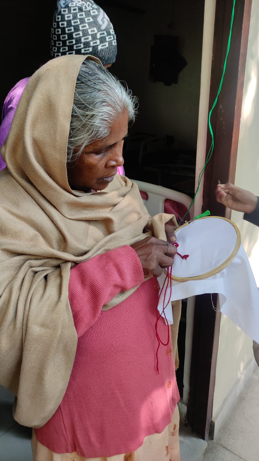
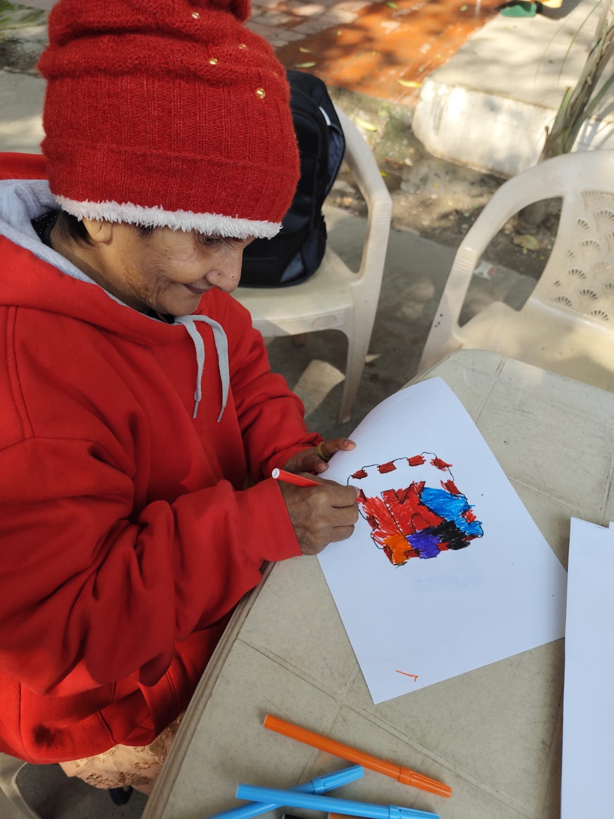
I used to have a small achaar business.
I never bought sweaters. I always crocheted them myself.
I used to draw as a child.
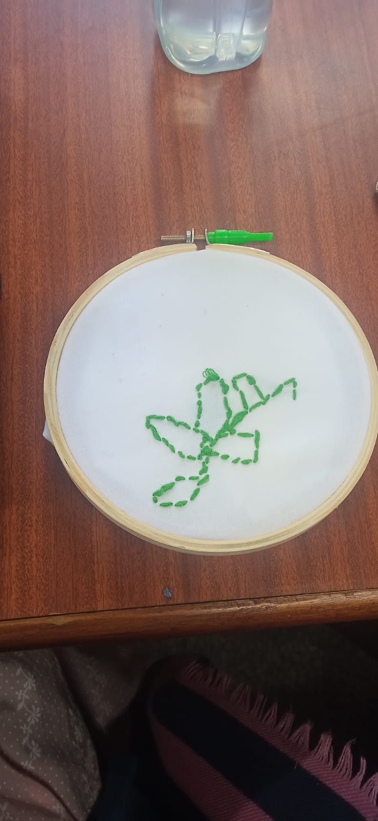
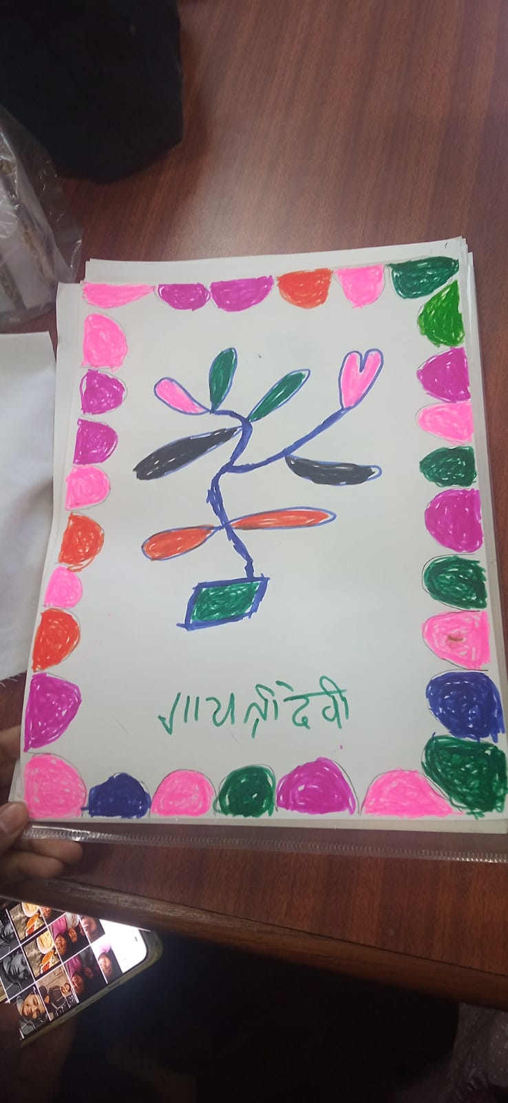
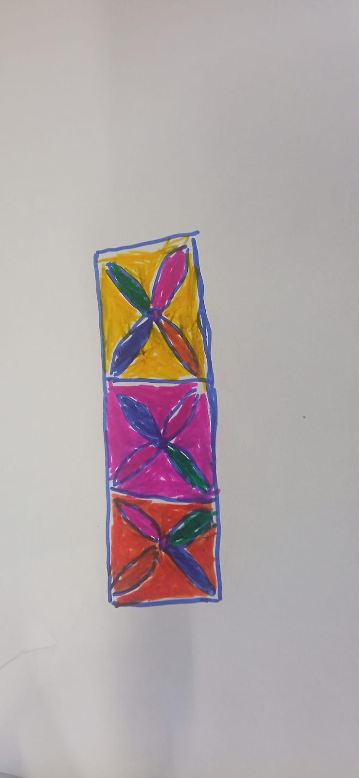
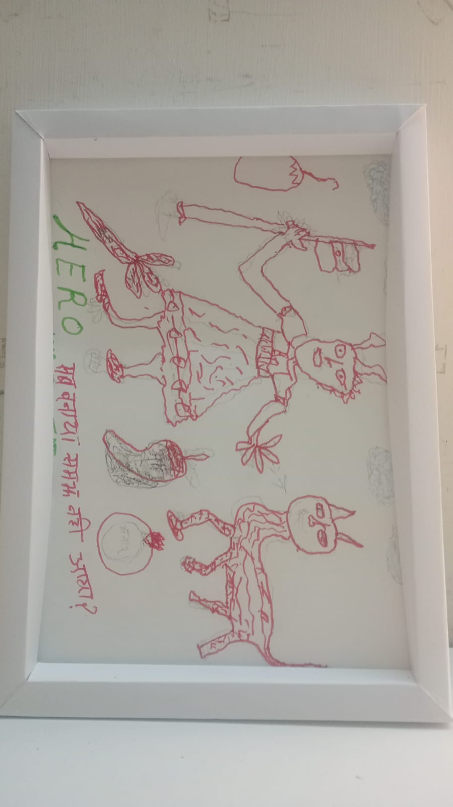
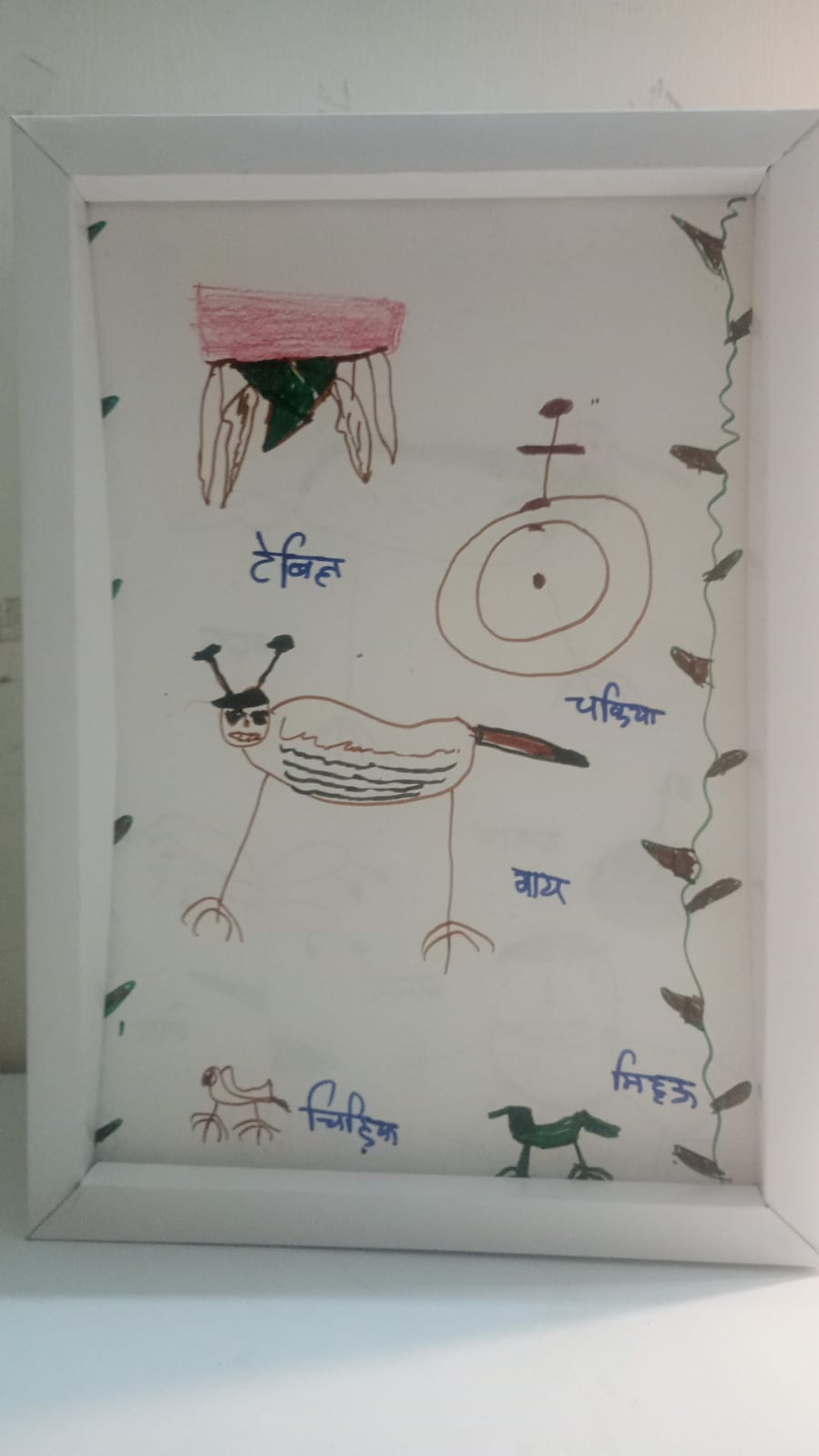
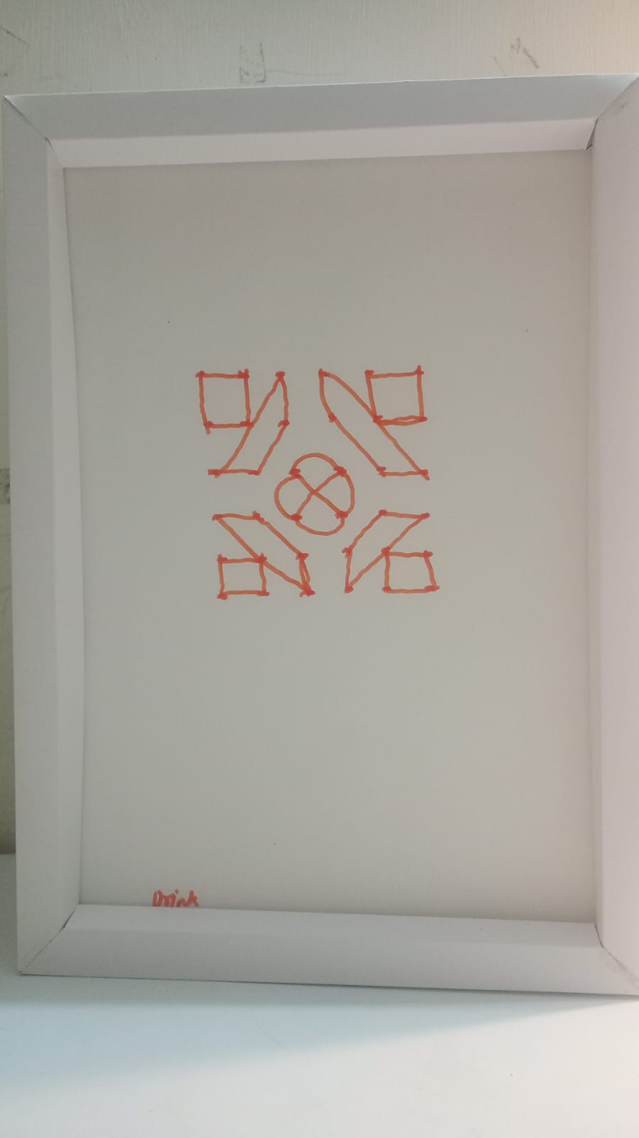
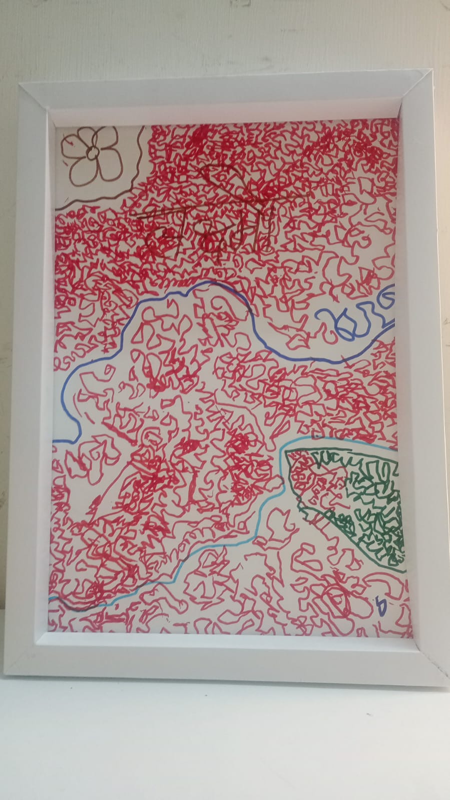
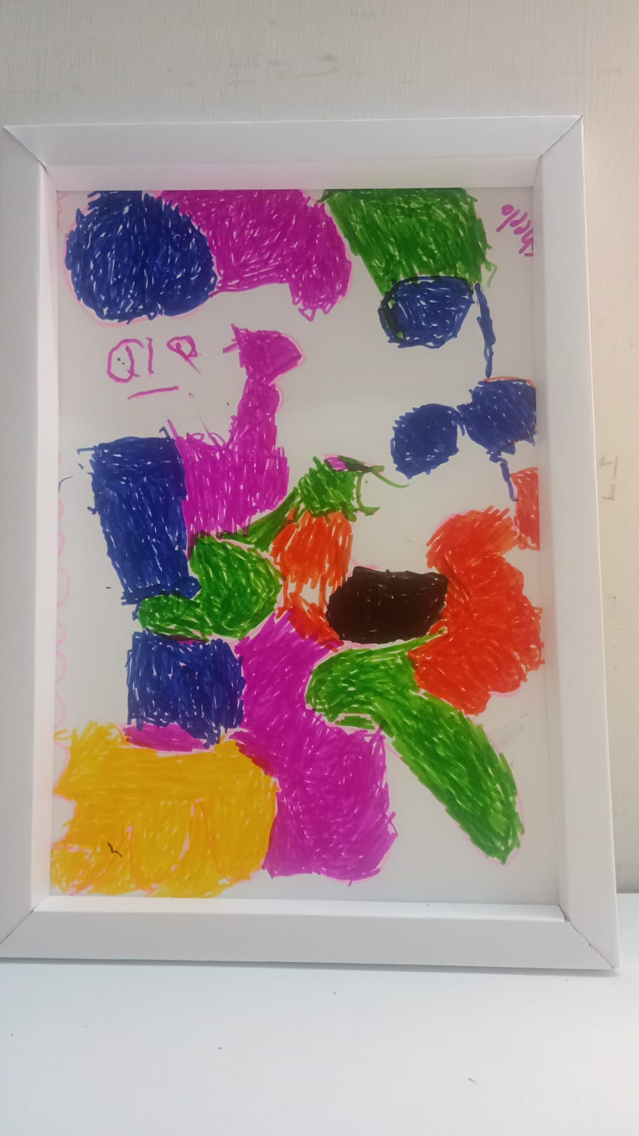
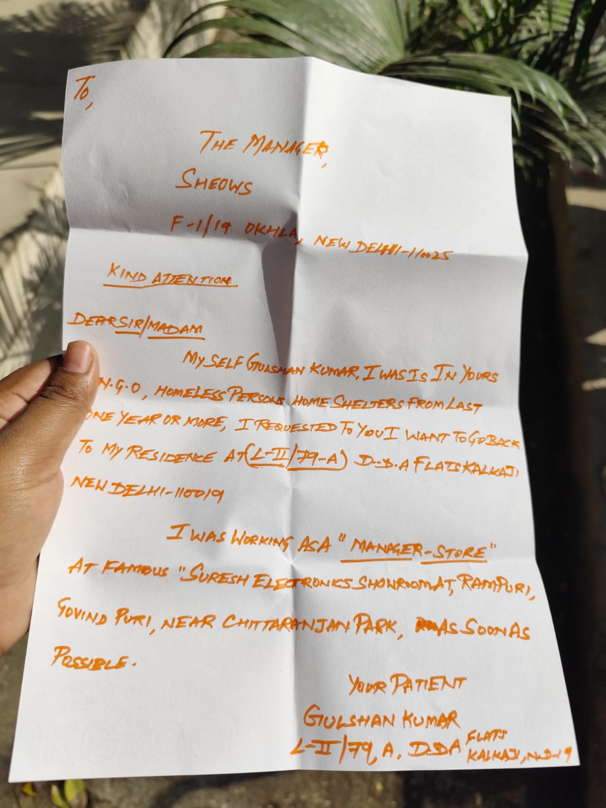
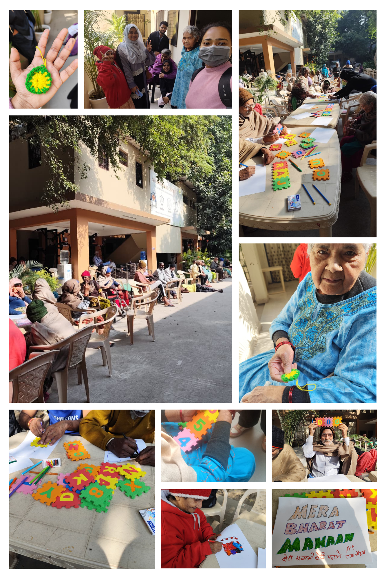
Activities transformed passive observation into active participation
Residents communicated more openly and collaborated with others during activities.
Residents shared memories and expressed emotions through creative mediums.
Passive observers became active contributors to community life.
A stronger sense of community and dignity emerged among residents.
The project aims to evolve into an exhibition showcasing artworks created by residents. This initiative seeks to:
This project demonstrated how simple creative activities can become powerful tools for emotional expression, social connection, and meaningful engagement. Designing with empathy — not just for users, but with them — created real, visible change.
Deep observation and informal conversations to uncover lived experiences.
Co-creating with residents rather than designing for them.
Crafting interventions that honour human dignity and emotional needs.
Keeping the human at the centre of every design decision.
Simple creative activities — drawing, crocheting, storytelling — became powerful bridges between isolation and belonging. This project is proof that empathetic design can transform the everyday experience of those who are often forgotten.